Oh!Porto experimental guidebook
By using this Guidebook the traveler will be challenged to skip the ordinary tourist attractions and create alternative itineraries chosen on the basis of an idea, feeling or thought... How? The city is in this book shown as a place that has its own life, rhythm, and identity, which cannot be understood only through the tourist experience. Therefore there are no routes nor pre-made statements for the reader, just a collection of hedonist concepts and images that aim to bring new and unique (individual) ways of understanding the destination.
This is merely meant to increase our receptiveness, ability to experiment and drift around, because being an experimental visitor means being active and curious about the local life, being ready to find your own discoveries and being able to give a bit of space to chance and serendipity.
The concept of experimental travel was developed by writer Joel Henry, the French director of the Laboratory of Experimental Tourism (Latourex).
Presented as a final thesis, this limited-edition is now officially registered as an intelectual property and the rights of publication belong only to its author.
- Autor: Andrea Lagunas
- Date: June, 2014
Inner structure & color palette
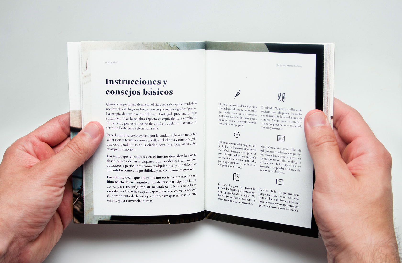
Most guidebooks are generally structured around four big questions: where to go, what to see, where to eat, and where to sleep. In many cases, these sections refer to the most popular and tourist spots where the local life is being extinguished. Creating a good storytelling and structure became into one of the biggest challenges of this project. The experimental guidebook was finally structured around the four main stages of a trip: anticipation, arrival, behavior, and return.
Each of these phases was renamed (see below) and transformed into different chapters that focused on the simple act of traveling, its emotional and yet whimsical impact on the visitor's experience.
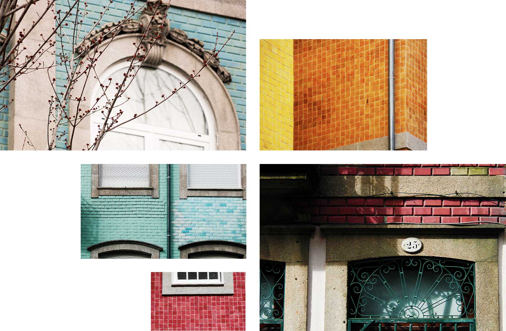
The color palette was taken from Porto’s most used colors on tiles and facades. It defines all the inner sections of the guidebook.
Four episodes, four phases of a trip
1. Advices (Anticipation)
A quick explanation of the book's concept, its proper use and basic tips for the trip. Pantone Black
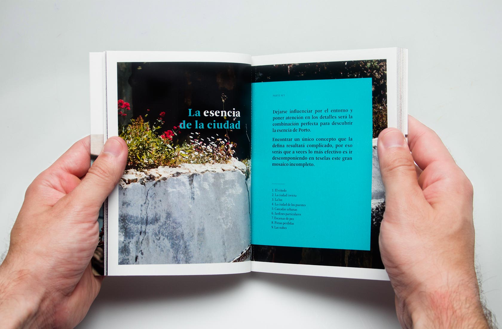
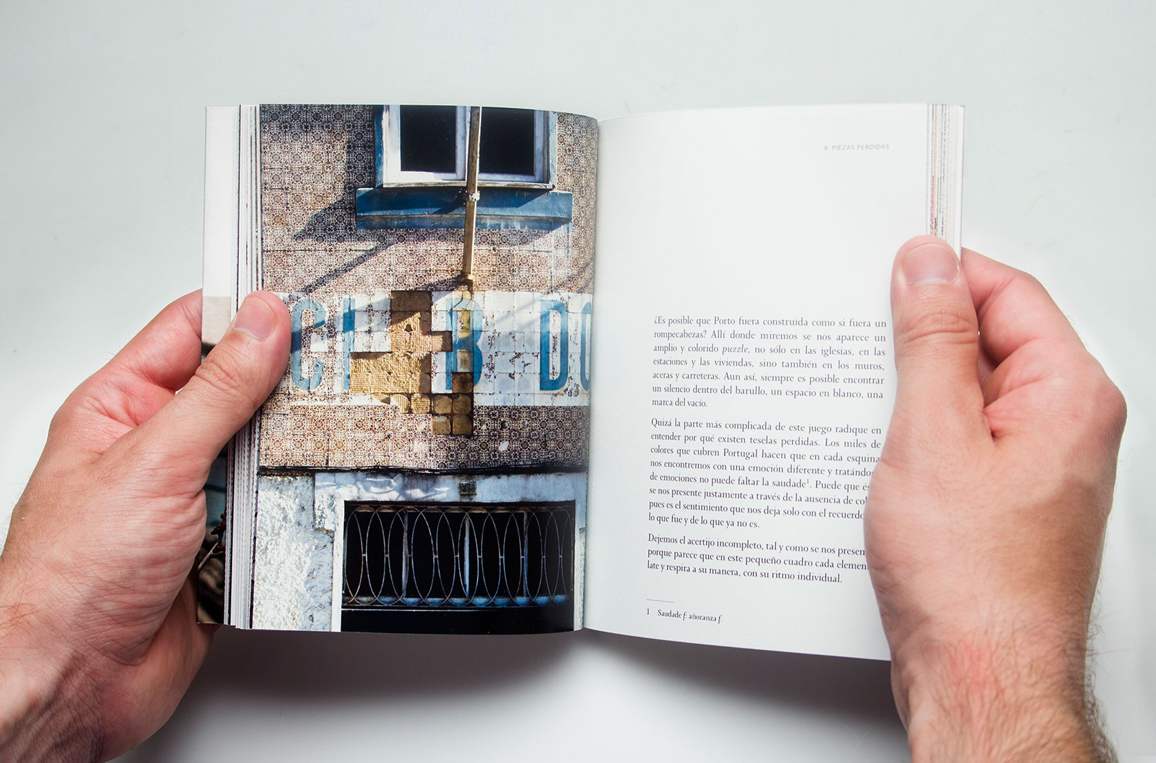
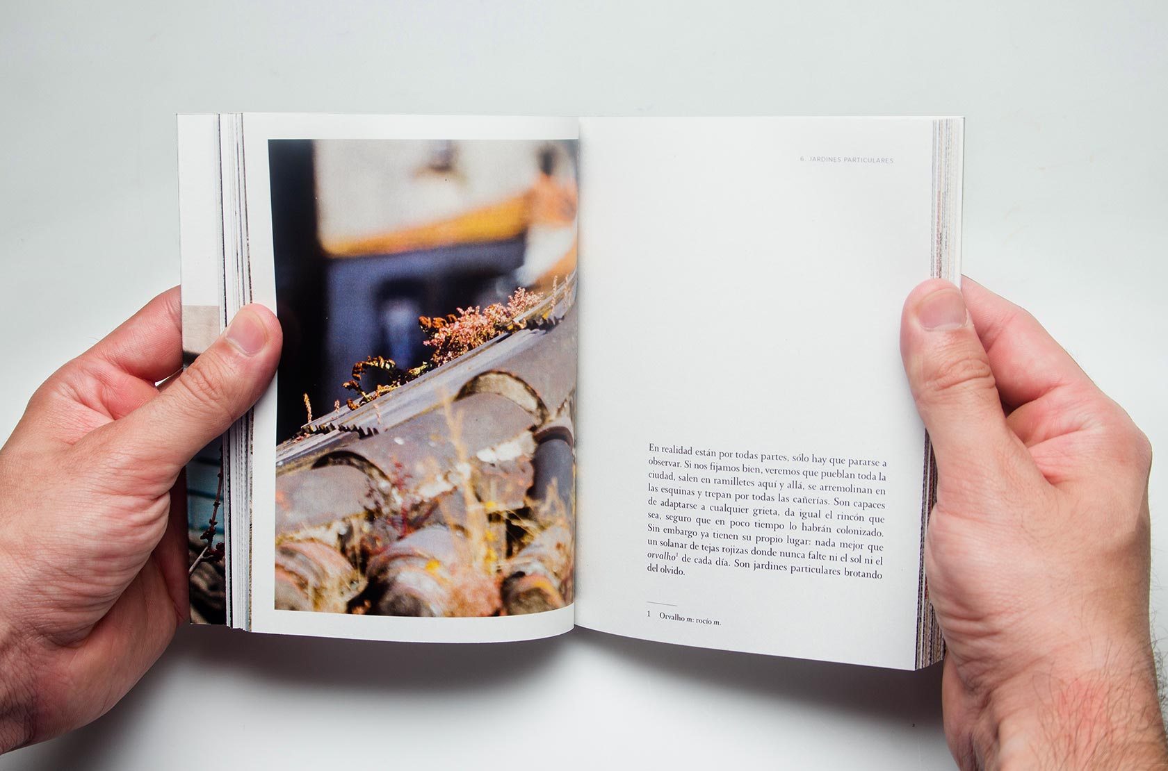
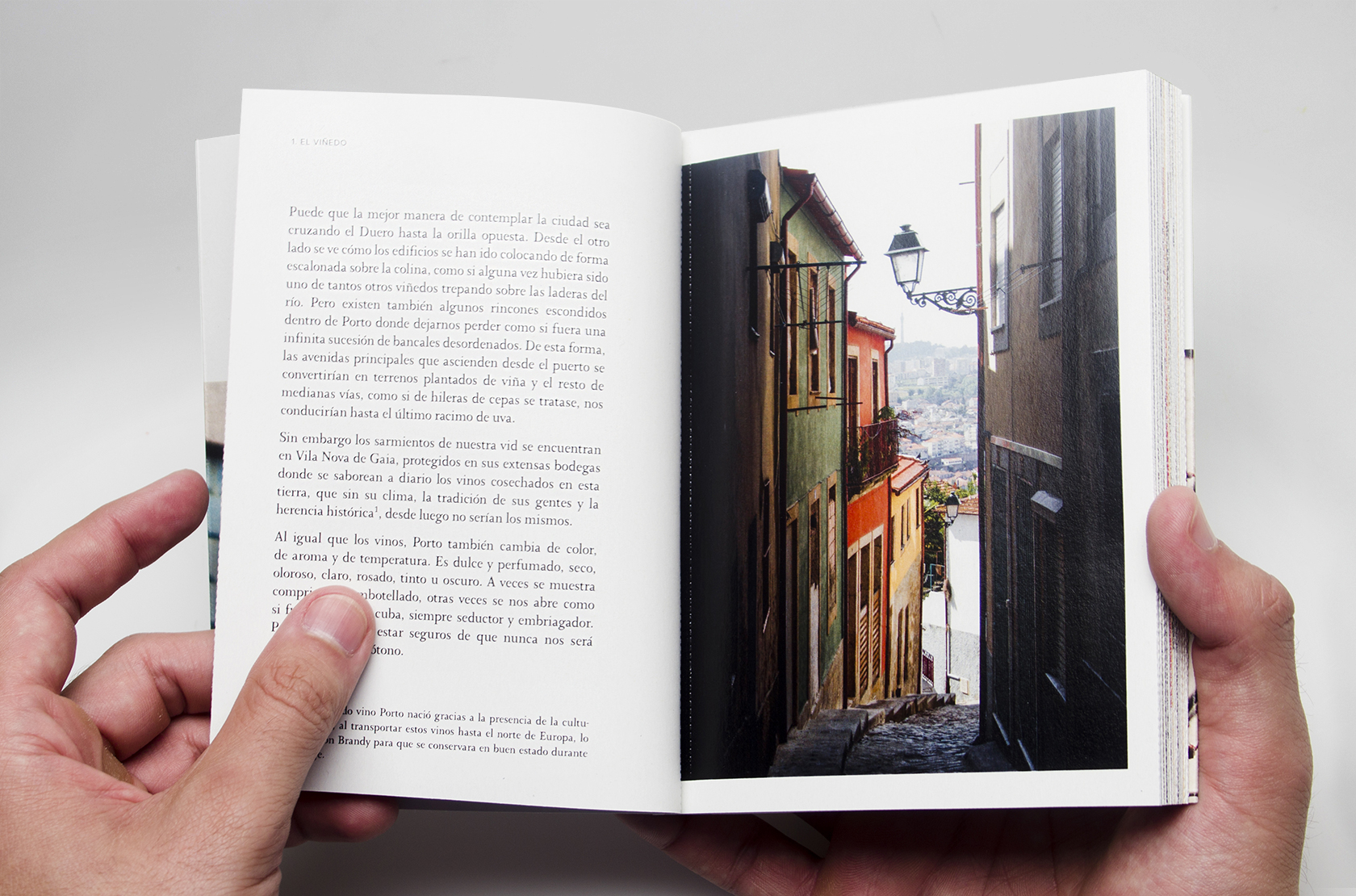
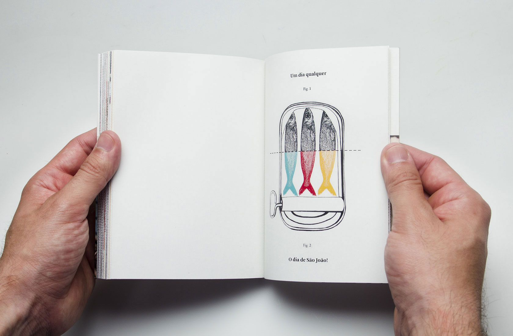
2. Essence (Arrival)
A section with some stories and pictures of the city's most unique characteristics. Pantone 3253.
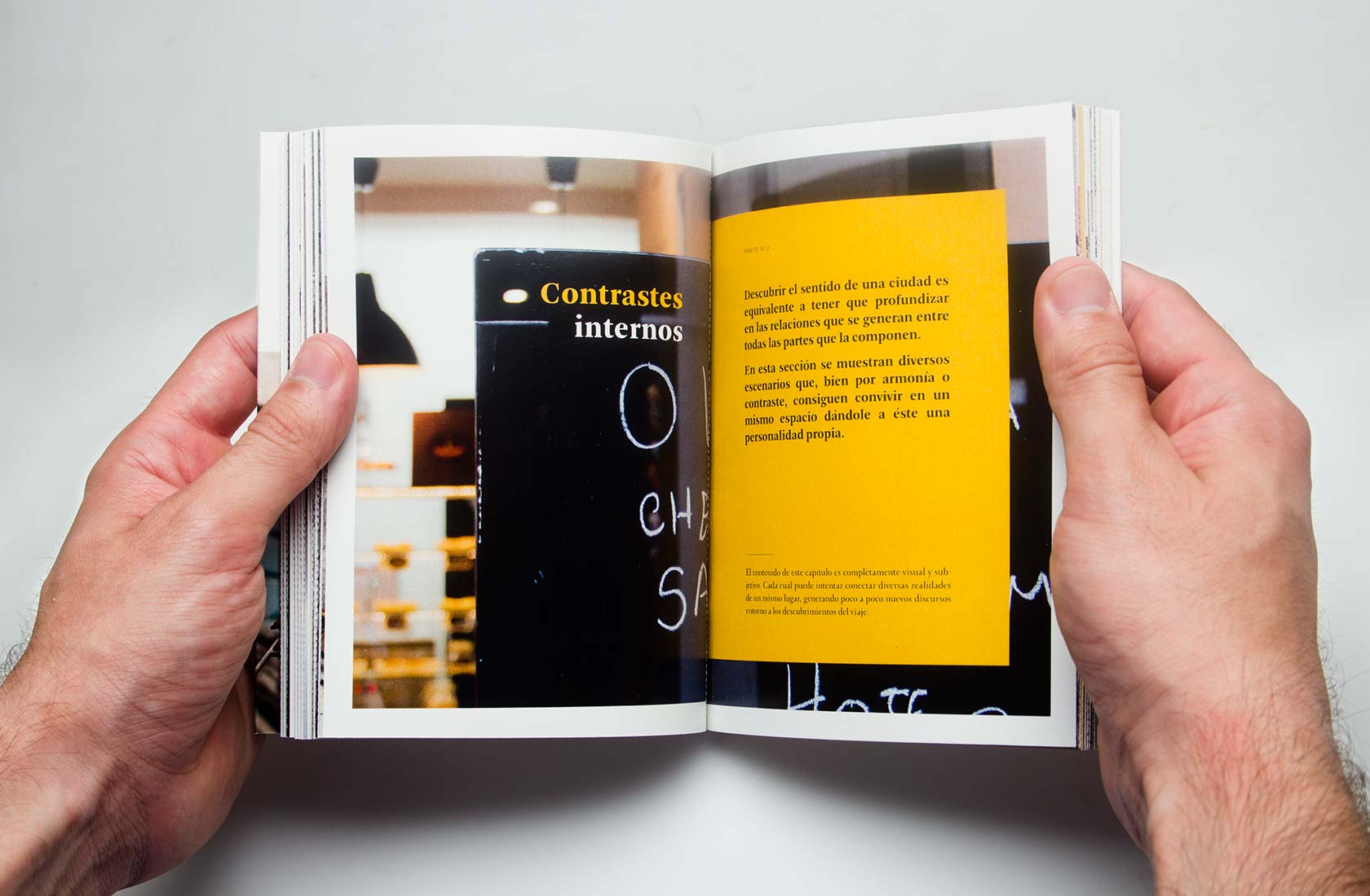
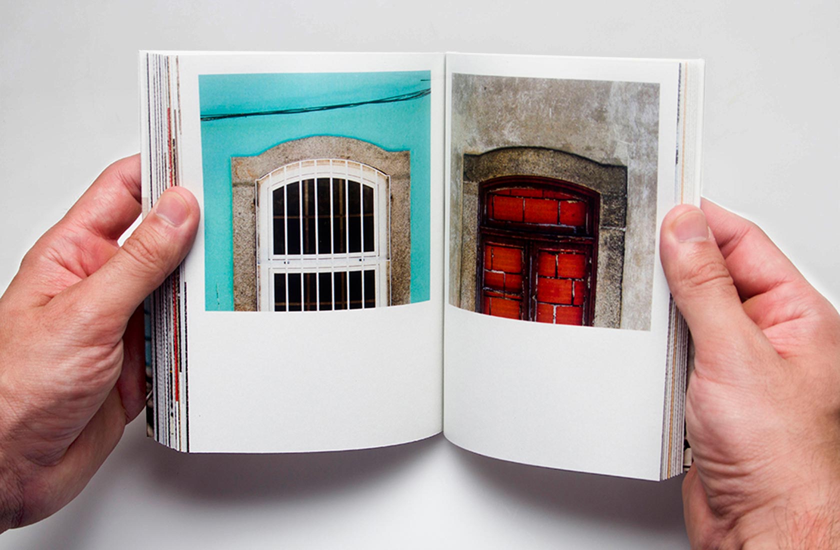
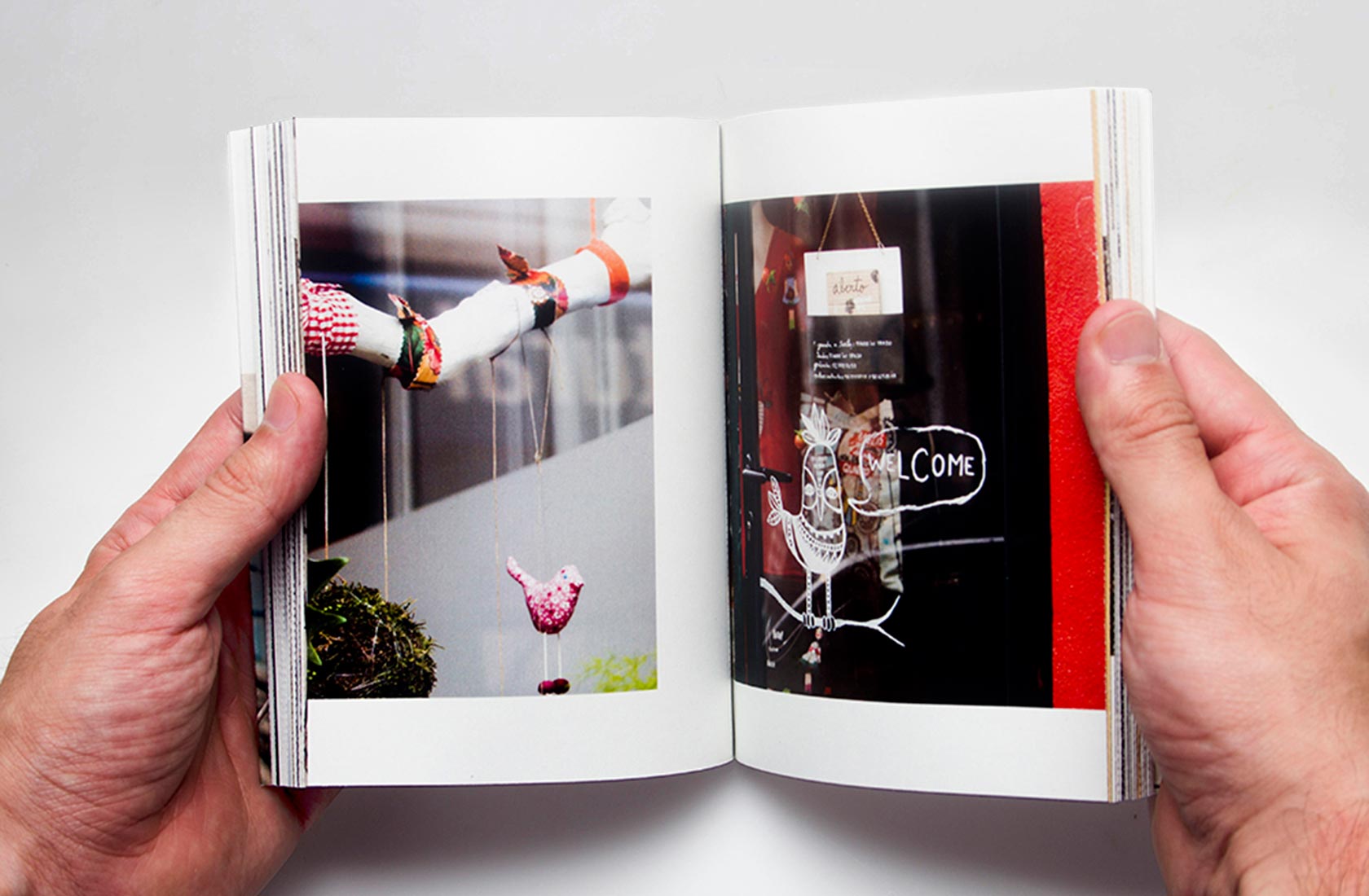
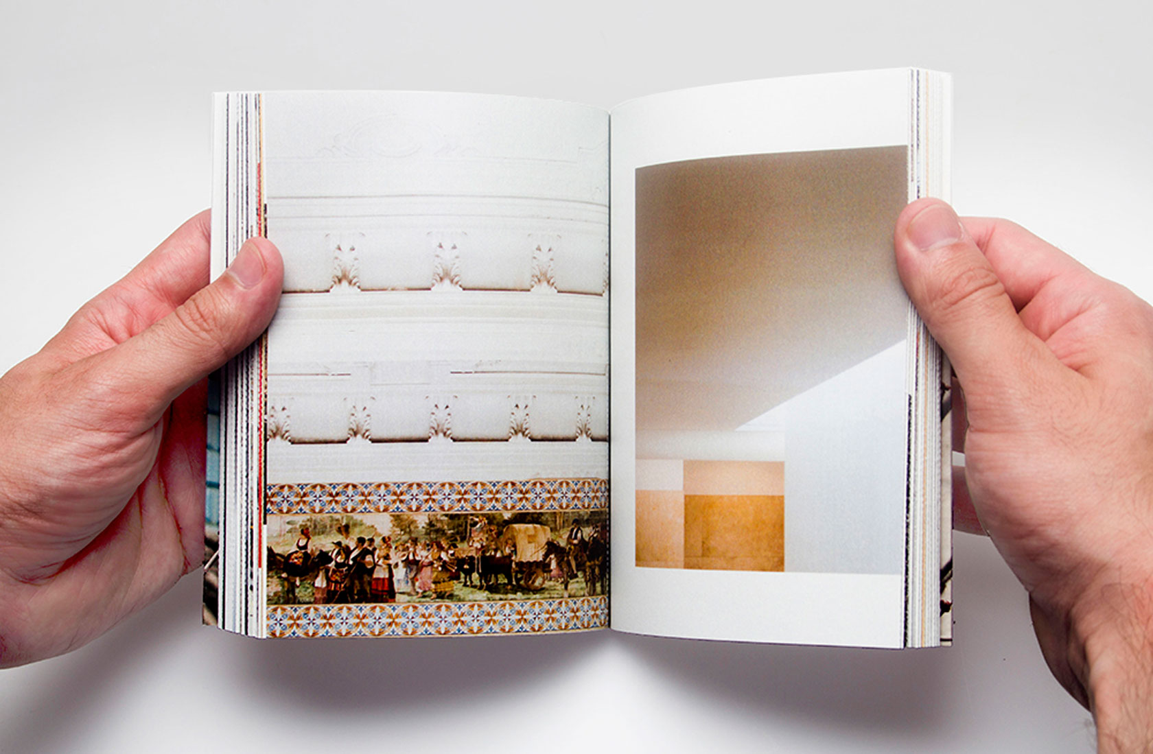
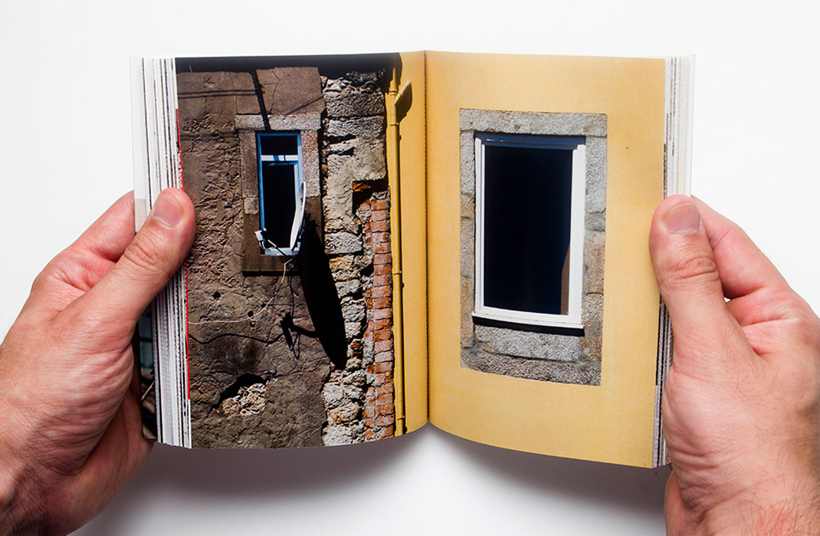
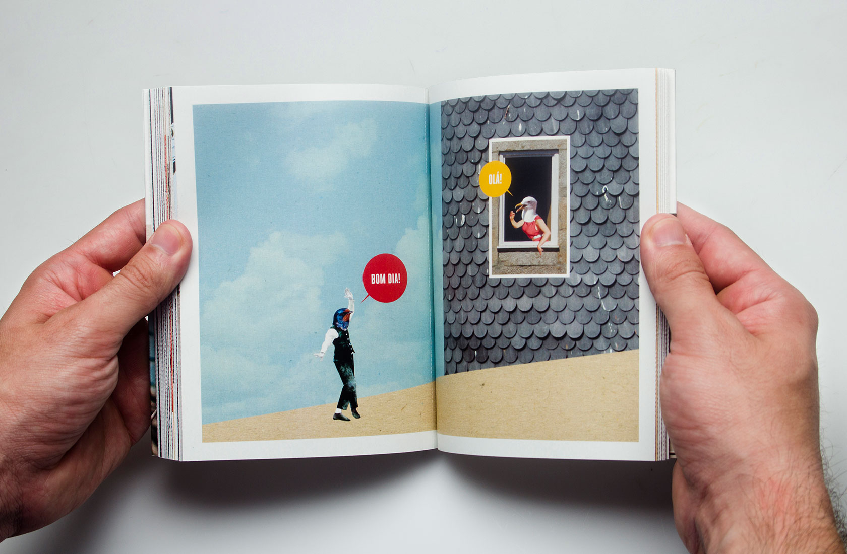
3. Contrasts (Behavior)
A presentation of contrasting images meant to offer a wider overview of Porto. Pantone 145.
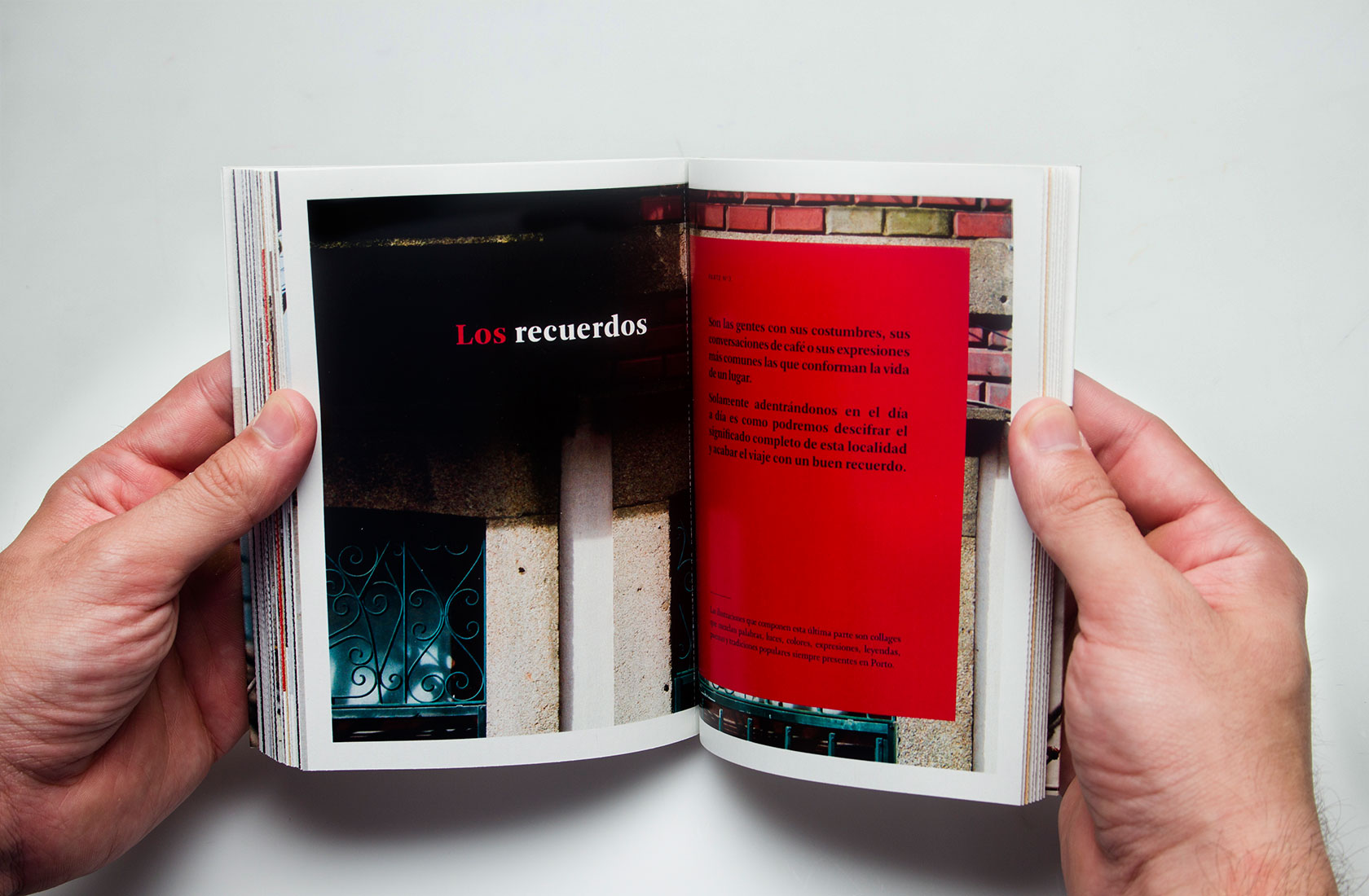
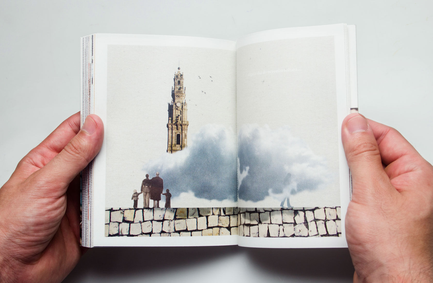
4. Memories (Return)
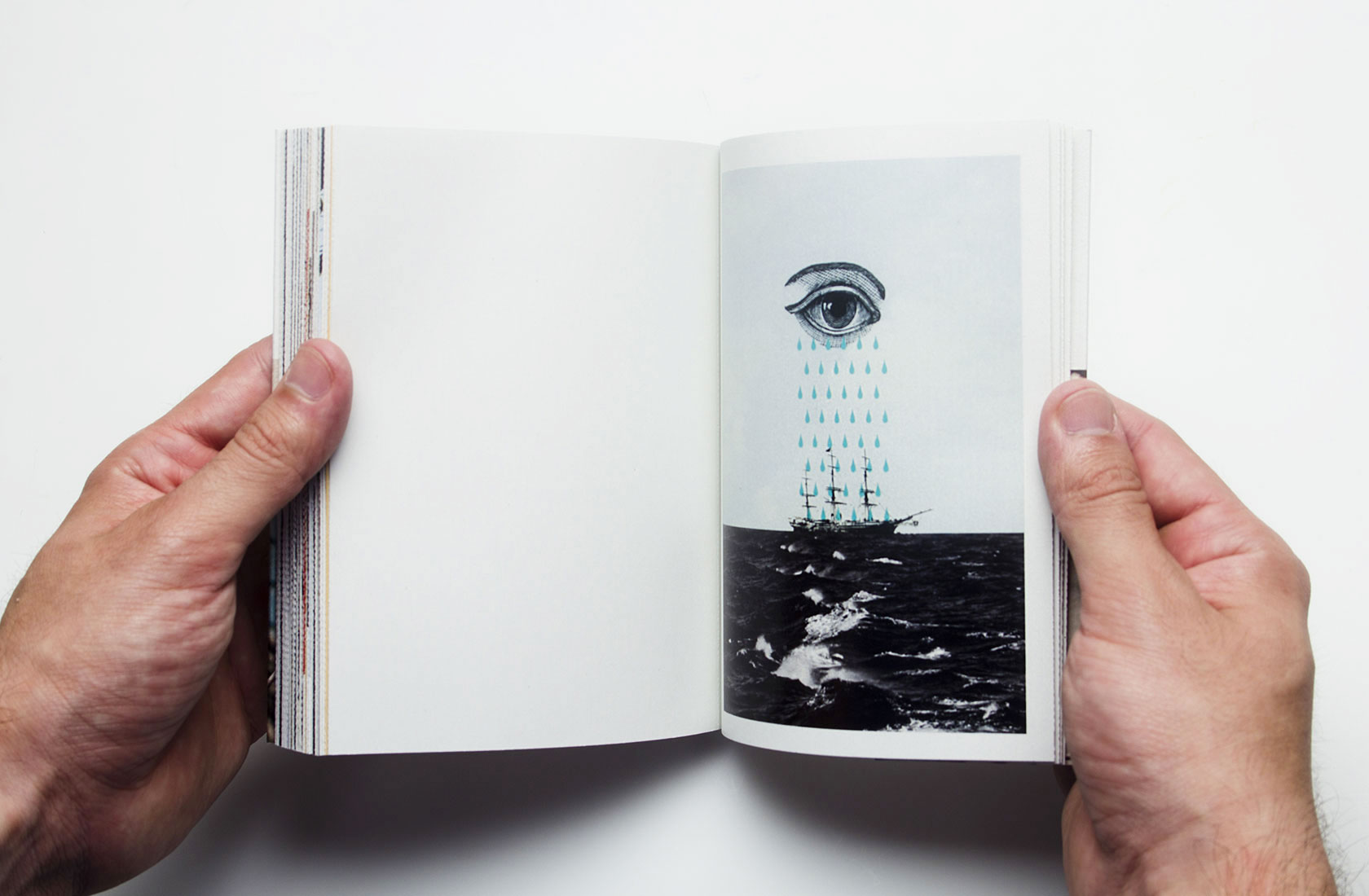
Collages portraying Porto’s way of living, traditions, culture, and popular expressions. Pantone 187
The "book-object"

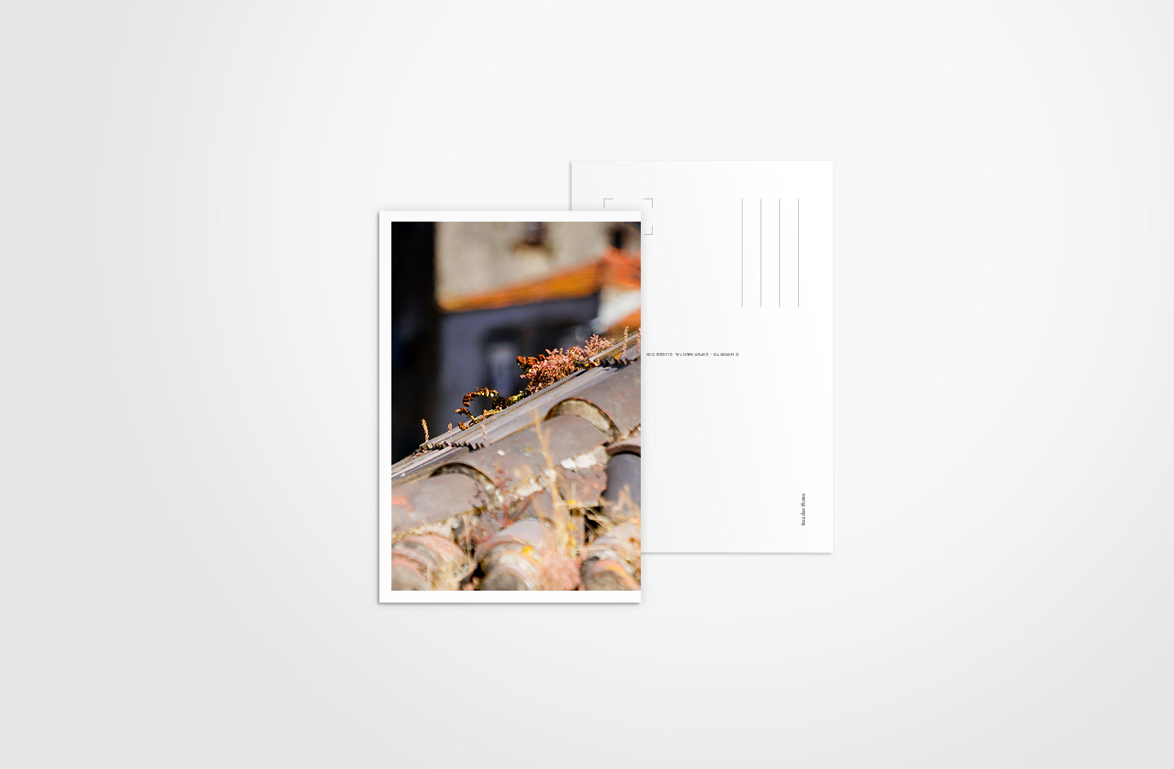
Every single page within this edition is a removable sheet of paper that, once it is ripped off from the spine, becomes into a standard postcard ready to be sent.
Each page shows at its reverse the name of the street where the picture was taken or a brief explanation about the image on the front.
Naming

Depending on where you live, you might call this city either Porto or Oporto. Both are correct, however, the actual Portuguese name of the city is Porto, which literally means port (seaport) and so, by naming it Oporto, we are simply referring to it as “the port”.
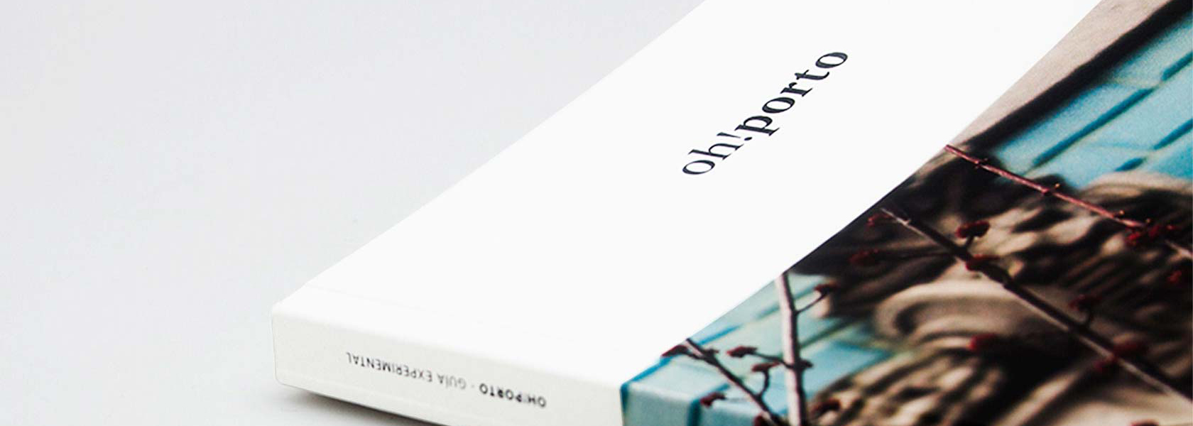
The name of this guidebook is then a play on words that uses the Portuguese name along with an onomatopoeia that refers to how surprising and beautiful this city can be. The logo is designed by using the same font in two different weights: Arnhem Fine Bold and Regular.
Gallery

Related Projects
-
See project →
Logbook for divers
Editorial design -
See project →
Nursing school identity
Logo design -
See project →
Physiotherapy
Logo design