
Website system
As Web Designer at Ada Health, I created the company's first unified design system to solve a critical problem: the website lacked consistency, with disconnected visual styles across Marketing and Product pages that undermined user trust and slowed development.
Working closely with four developers, I audited the existing website, identified reusable patterns, and built a scalable component library using a 12-column Bootstrap grid and mobile-first approach. Over six months, I redesigned key web pages while establishing visual standards, a three-size icon system, and a shared typography library that aligned with Ada's product design.
My role:
- Conducted visual audit and identified inconsistencies across 20+ web pages
- Designed and documented reusable component library
- Created icon system and typography standards shared across web and product
- Collaborated with developers to implement responsive, accessible designs
- Redesigned homepage, product pages, and core marketing pages
- Company: Ada Health GmbH
- Role: Web Designer
- Date: August, 2019
Context & Problem
Over 80% of Ada Health's web traffic came from mobile devices, yet the website wasn't optimized for mobile-first experience, creating clear risk to user retention and conversion.
The existing web experience lacked consistency and familiarity, resulting in fragmented patterns and an unclear brand expression across different touchpoints. Addressing this required establishing a cohesive system that supported both usability and business outcomes, rather than applying surface-level visual changes.
Creating a system
I initiated the project by defining a unified visual foundation for the web experience. At the time, the site reflected a mix of legacy design choices, heavy use of stock imagery, inconsistent typography and newer, more vibrant elements inspired by Ada’s mobile application. This inconsistency weakened brand cohesion and increased cognitive load for users.
To address this, I established a standardized color palette and visual language adopted across Product and Marketing, creating a shared system rather than team-specific solutions. I audited and refactored core components, ensuring consistent typography, color usage, and responsive behavior across all breakpoints.


Redesigning the website
Given the mobile-heavy audience, the redesign prioritized a small set of high-impact decisions aimed at improving clarity, engagement, and conversion.
- Persistent primary call to action: A clear primary CTA was kept consistently visible on the main screen. Placing it in the global navigation ensured it remained accessible regardless of content length, reducing the risk of missed conversion opportunities.
- Compact, focused hero sections: Each page was structured around a concise and impactful hero section, creating clear visual hierarchy and helping users quickly understand the purpose of the page.
- Reinforced conversion opportunities: Secondary CTAs were introduced at the end of key pages, ensuring users retained a clear path to engage with Ada even after consuming the full content.


What I learned
This project taught me to balance ideal solutions with practical constraints. With limited time and resources, I prioritized standardizing the most frequently used components first, establishing foundations that could evolve rather than waiting for perfection. This pragmatic approach delivered immediate value while creating pathways for future improvement.
While Marketing and Product teams cooperated, we worked in silos without regular check-ins. I saw that design systems require active and almost constant communication. In future projects, I would create more shared documentation to keep teams aligned and identify opportunities for pattern sharing across platforms.
We made progress on inclusive illustration and met basic WCAG standards for color and typography, but deferred some accessibility improvements to protect brand consistency but I think that accessibility and brand aren't in conflict, they require creative problem-solving and can strengthen each other when approached strategically.
Creating the system was just the beginning. I underestimated the ongoing effort required to maintain and evolve it. I now understand that successful design systems need dedicated ownership and clear governance processes to stay relevant and adopted.
Related Projects
-

See project →
Patient Application
First design system -

See project →
Icon Set
A shared system across departments -
See project →
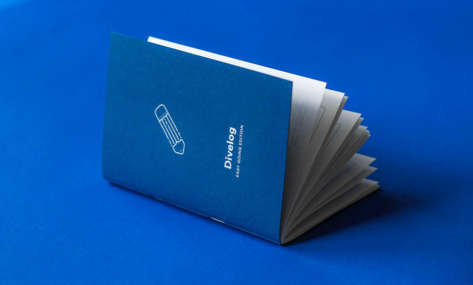
Logbook for divers
A purpose-built and compact logbook