App system
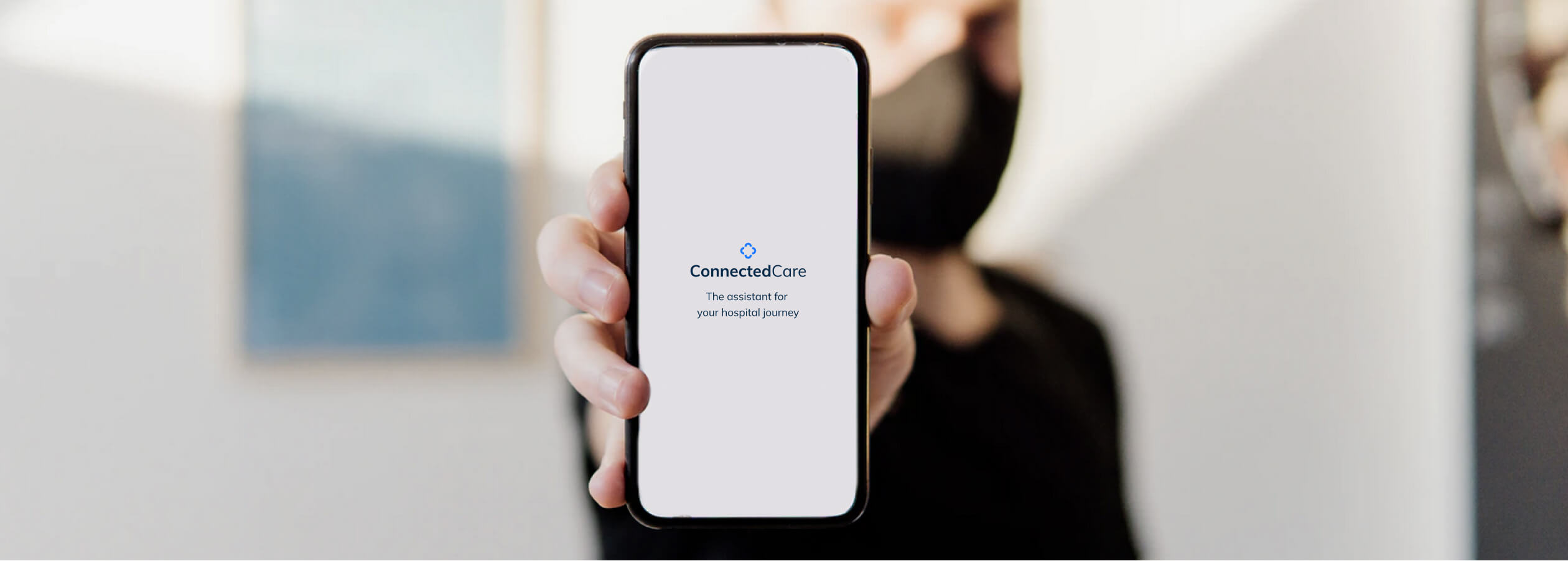
When I joined ConnectedCare (end of 2019), the mobile application was still underdeveloped and waiting for someone to take care of all visual resources. The team managed to design the very first MVP and user flows. However, the app soon would have to grow, get more sophisticated, and, finally, be released to the App Stores. My first task, as the only official Designer on the team, was to take ownership of all the UI/UX-related matters and organize all the resources in a scalable way.
Responsibilities:
- UI design: Visual tone of voice, Interface design
- Design system: Design principles, Component library and specs.
- Creative direction: Illustration, Iconography
- UX design: Redesign strategy and user flows
- Company: BEWATEC GmbH
- Role: Design lead and Illustrator
- Year: 2020
Initial analysis
As I used the first month to get familiar with the complexity of the product, I first focussed on getting the visual language figured out. After a quick glance, I realized that the application presented a lot of inconsistencies in the UI: the color palette was unclear, the brand was undefined, some component variants were unjustified, and many WCGA guidelines were overlooked.
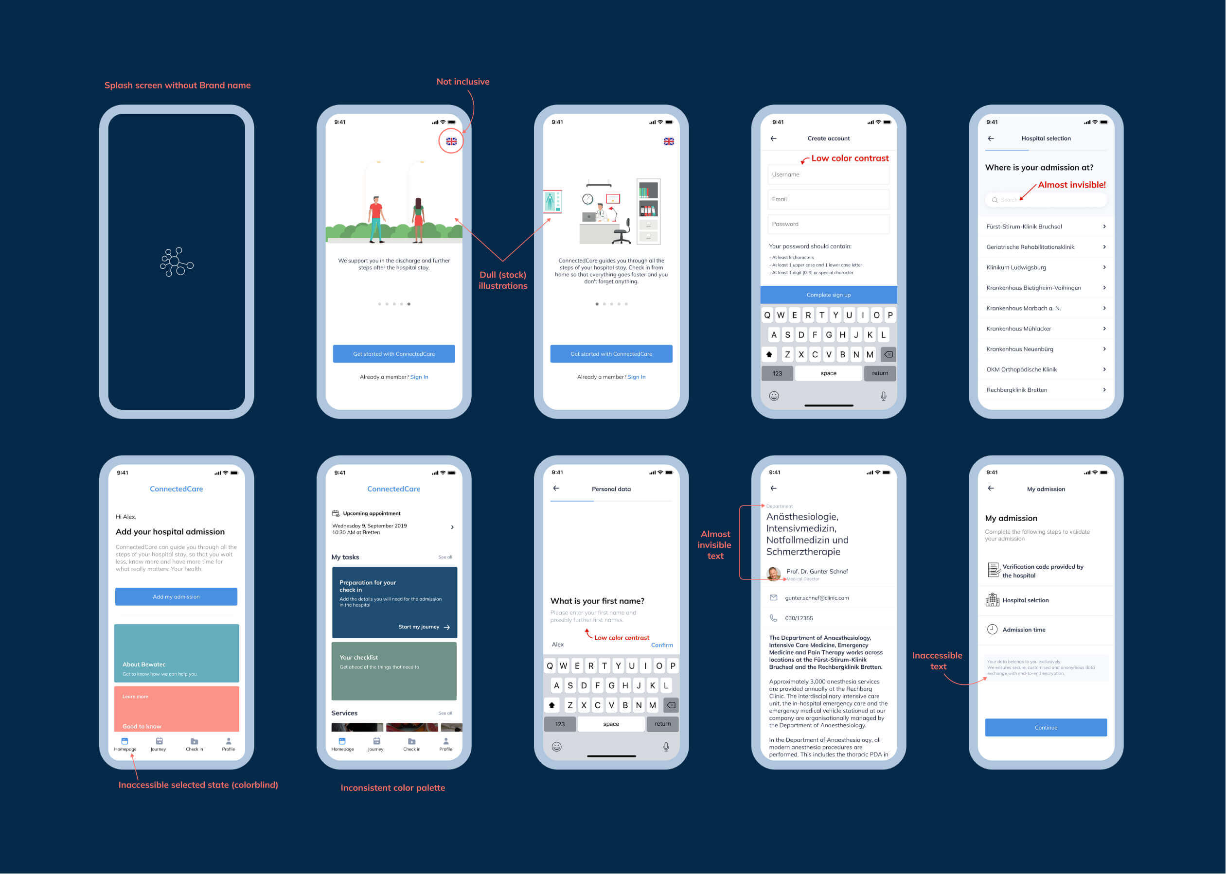
Generally speaking, the app felt unbranded, dull, and unreliable. Since the ConnectedCare logo wasn’t yet fully specified, I concluded that I had to unravel the branding mystery and build a system from there. After a brief analysis I found a few items I could keep and plenty of elements I could dismiss.
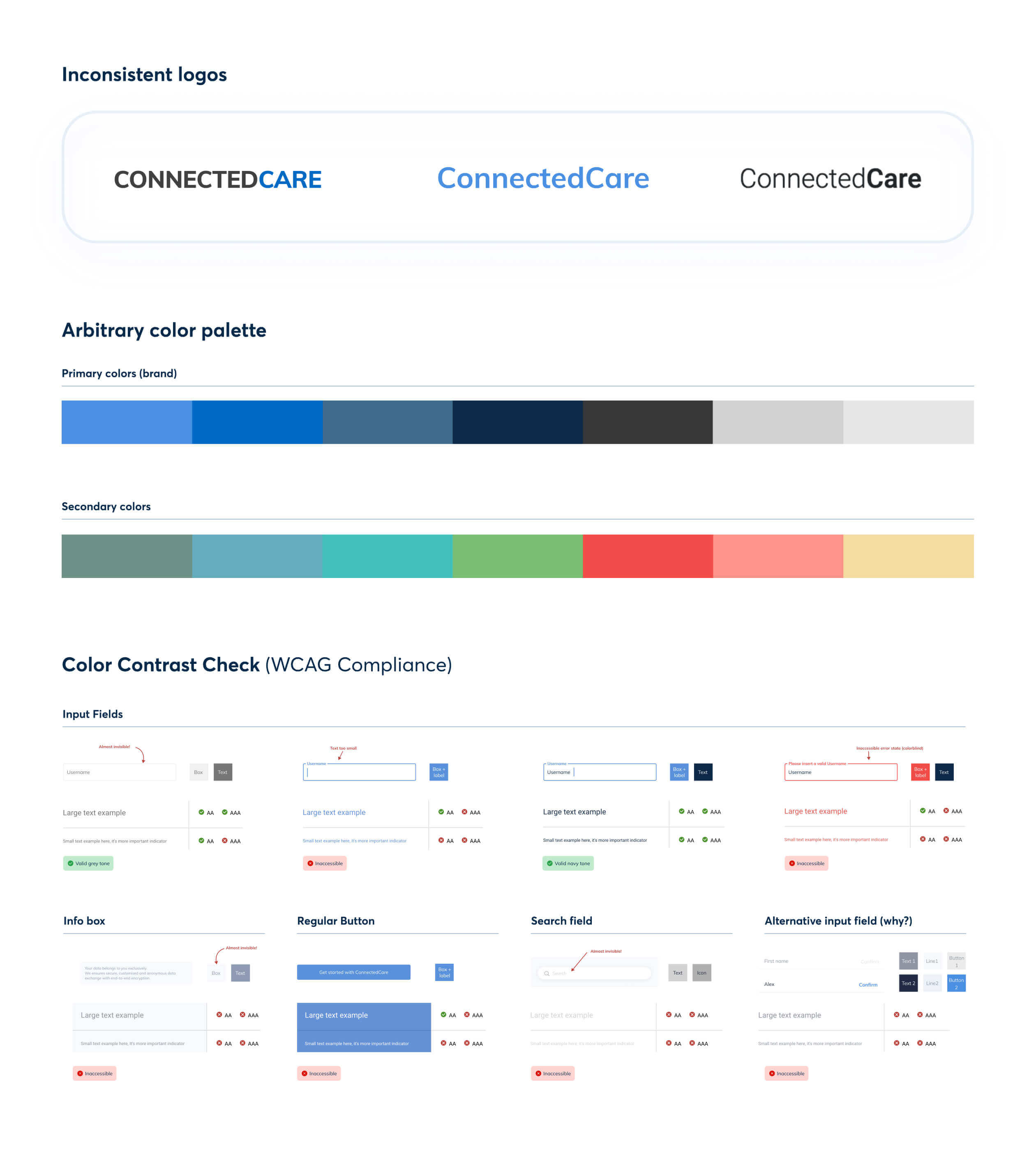
This analysis showed that the future brand and design systems could use greys for texts, navy for headings, and blue for highlights. However, I still had to find the other pieces of the puzzle and clarify the logo situation. Hopefully, I'd get the buy-in from the Marketing department to settle on a new, merged, logo version.
Internal brand research
Since understanding the brand and its personality was crucial for this project, I kicked it off with a short survey. The questionnaire aimed to define the corporate identity, the expected tone of communication, and the message to send to its users.
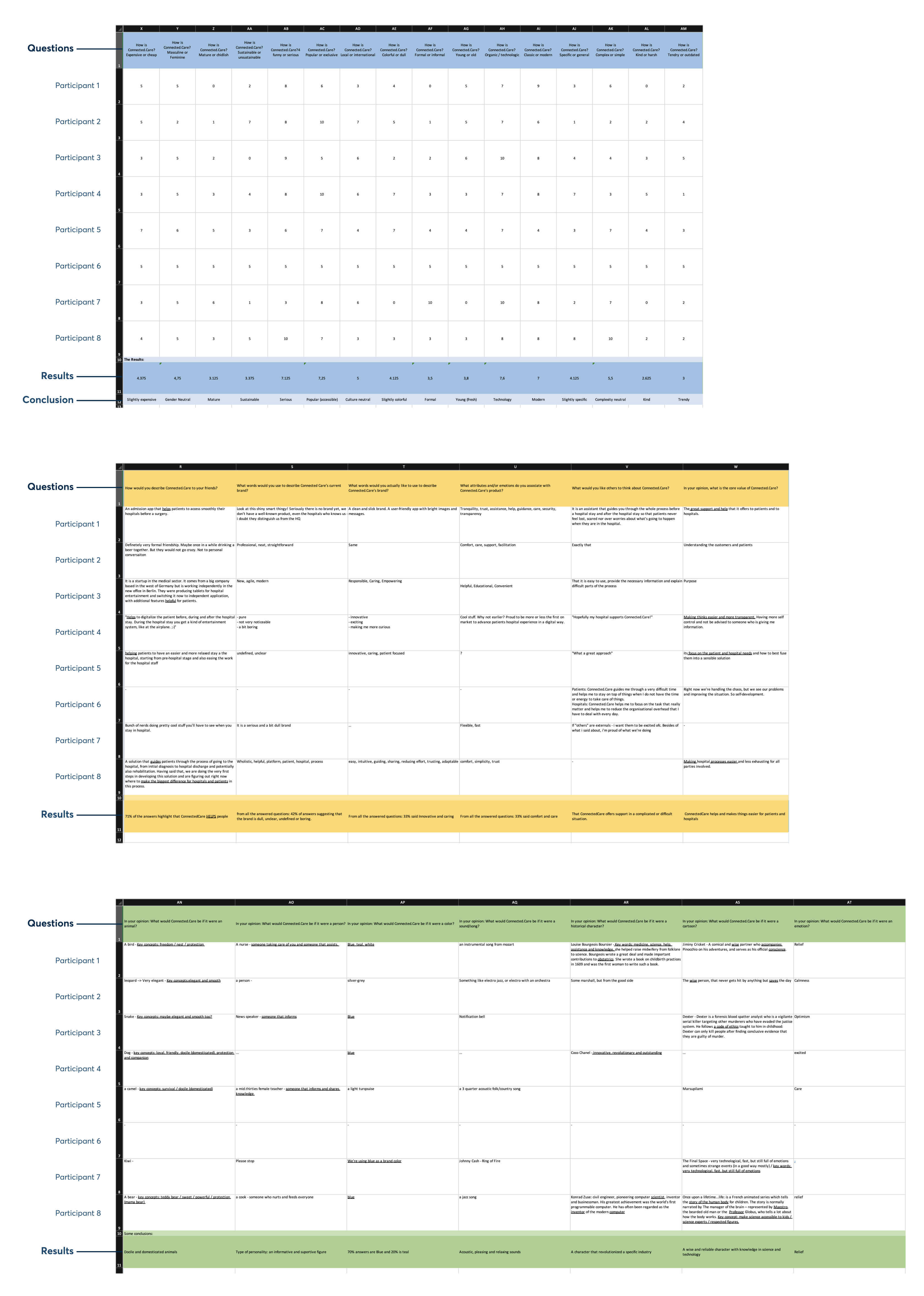
The answers gathered showed the following aspects to consider in our future brand:
- Be direct: the brand must be simple and easy to understand by our end users.
- Focus on the human side: the brand focuses on the patients instead of the technical aspects of the product.
- Maintain consistency: the brand has to remain consistent and harmonious throughout all platforms.
However, the initial brand didn’t represent these concepts. The survey was enormously helpful in communicating these issues across departments and moving towards a consistent voice. Along with the Marketing team, we quickly created a simple list of essential traits our brand should convey:
- Values: We are an assisting app for people who need a calmer, more organized, and easier healthcare system. We believe everyone deserves access to the highest attainable health assistance. We place at the center of our work support, facilitation, guidance, and comfort so that healthcare processes can be simple and transparent.
- Personality: We are approachable, caring, and easy to talk to without being boring or pretentious. We aim to help patients easily organize their hospital stay so they feel reassured, empowered, and comfortable during the process.
- Voice: We are transparent, helpful, and reliable to our users. We must write in a way that feels natural, comforting, and clear. At the same time, we must also be straightforward and use a formal voice to speak flawlessly and respectfully. We want to come across as a neutral and open-minded brand that doesn’t judge anyone regarding their gender, ethnicity, or religion.
Rebranding
By the time I got hands-on logo making, I already had a clear idea of the product and its personality. I also knew the company needed to “clean” the logo and avoid a complete 360º rebranding. Therefore, I tried to respect some of those distinctive aspects I saw in my initial examination and adjust the visuals to perform well once used within a design system:
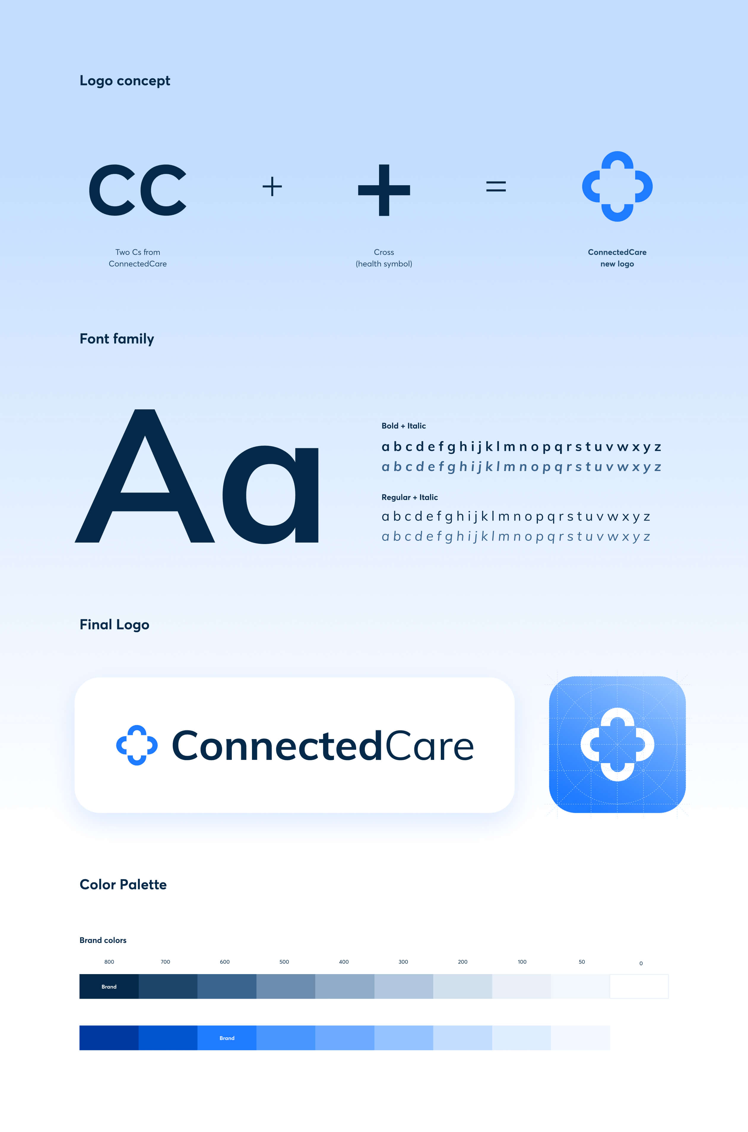
The new brand consisted of two elements: the logotype (the letters that form the name: ConnectedCare) and the logomark (the iconic image that symbolizes ConnectedCare).
I chose the Muli (or Mulish) font family for the logotype. This typeface was already present in the application, and despite its geometrical characters, it infers a soft touch into the brand and the app.
The new logomark played gracefully with character C (Connected Care) to create a pattern resembling the health cross. Though it was a geometrical shape, its rounded ends and open edges helped convey an approachable and kind personality. The new logomark showed the commitment to enhancing a wide range of medical experiences and overall healthcare services, but it also emphasized the company’s mission to unify all health forces and stakeholders in one single platform.
Generating the design system
With the logo, the font, and the colors sorted out, I could already proceed to determine the rest of the particles of an atomic design system. I initiated the process by agreeing with programmers on a grid unit that would remain “untouched” from then onwards. That unit was 4, an undividable number I would refer to every time I had to create a component from scratch.
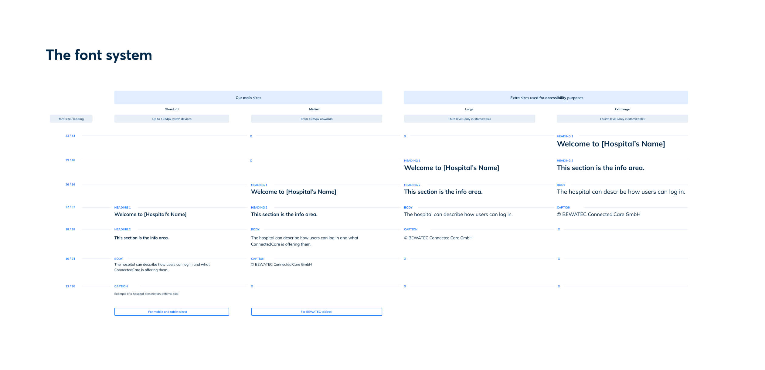
The font hierarchy system built for this project (screenshot below) uses multiples of 4 for line-height (leading) of each font style. This allows the text box to sit perfectly in a grid based on 4x4 pixels.
Expanding the palette was a necessary task to tackle as we needed to use system colors soon (colors used for notifications, alerts, and errors). The color spectrum ranged from 800 to 0 (0=white, 1000=pure black) to offer designers more flexibility and allow them to create on-brand illustrations.
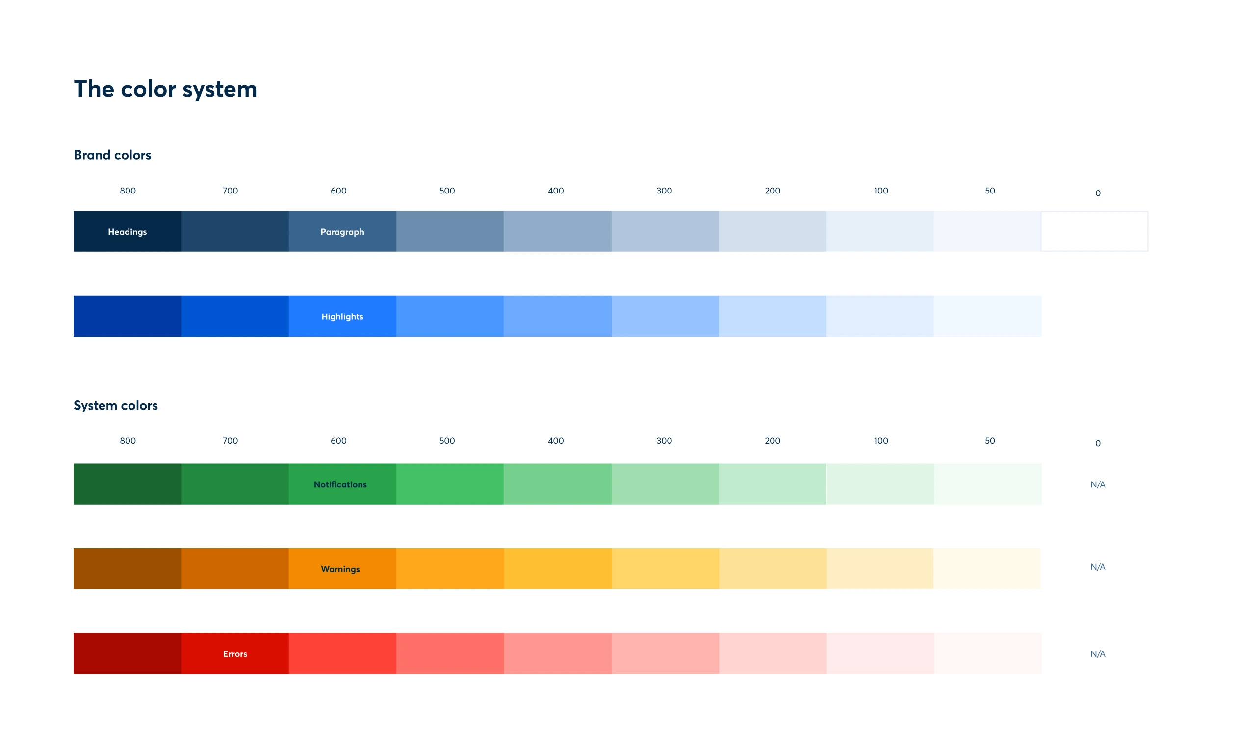
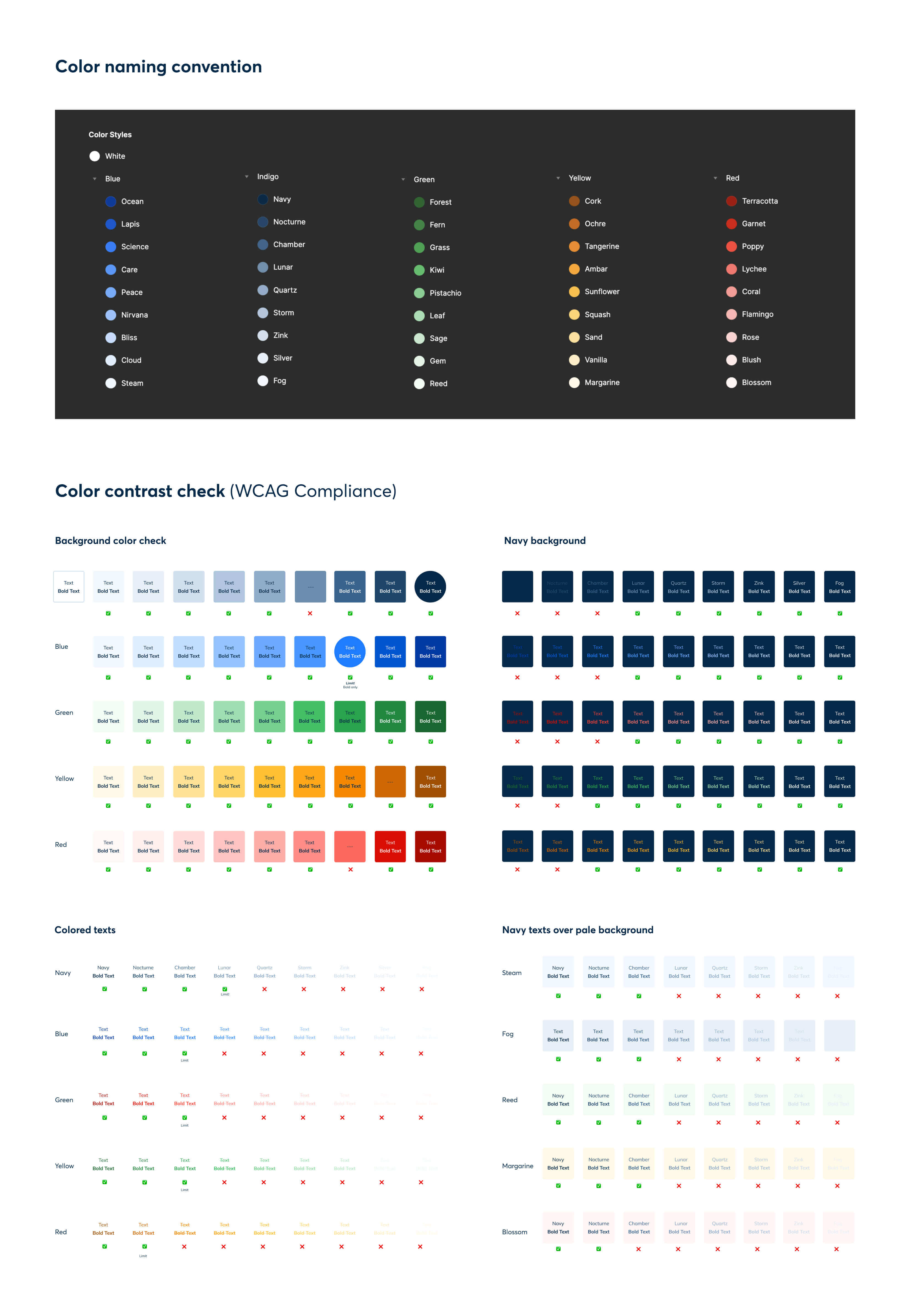
I created a total of 46 tones, which could perhaps turn confusing for other peers. I gave each shade a unique name so we could identify them, and created a complete color guide to avoid accessibility and color contrast issues.
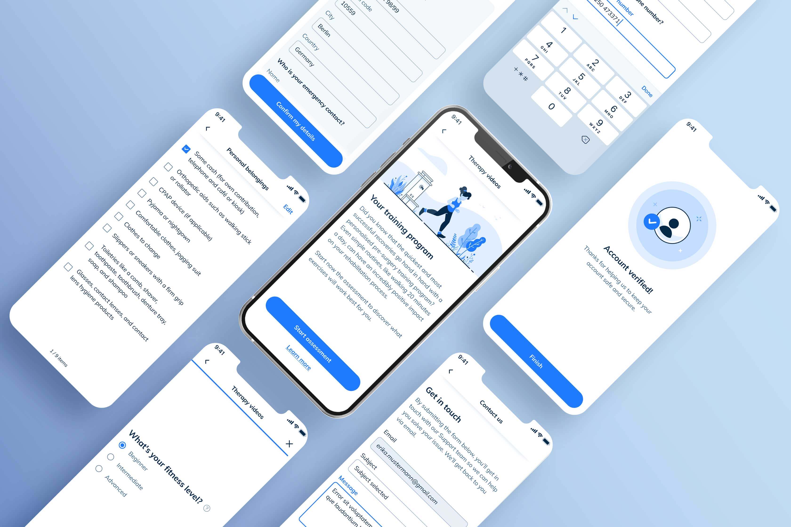
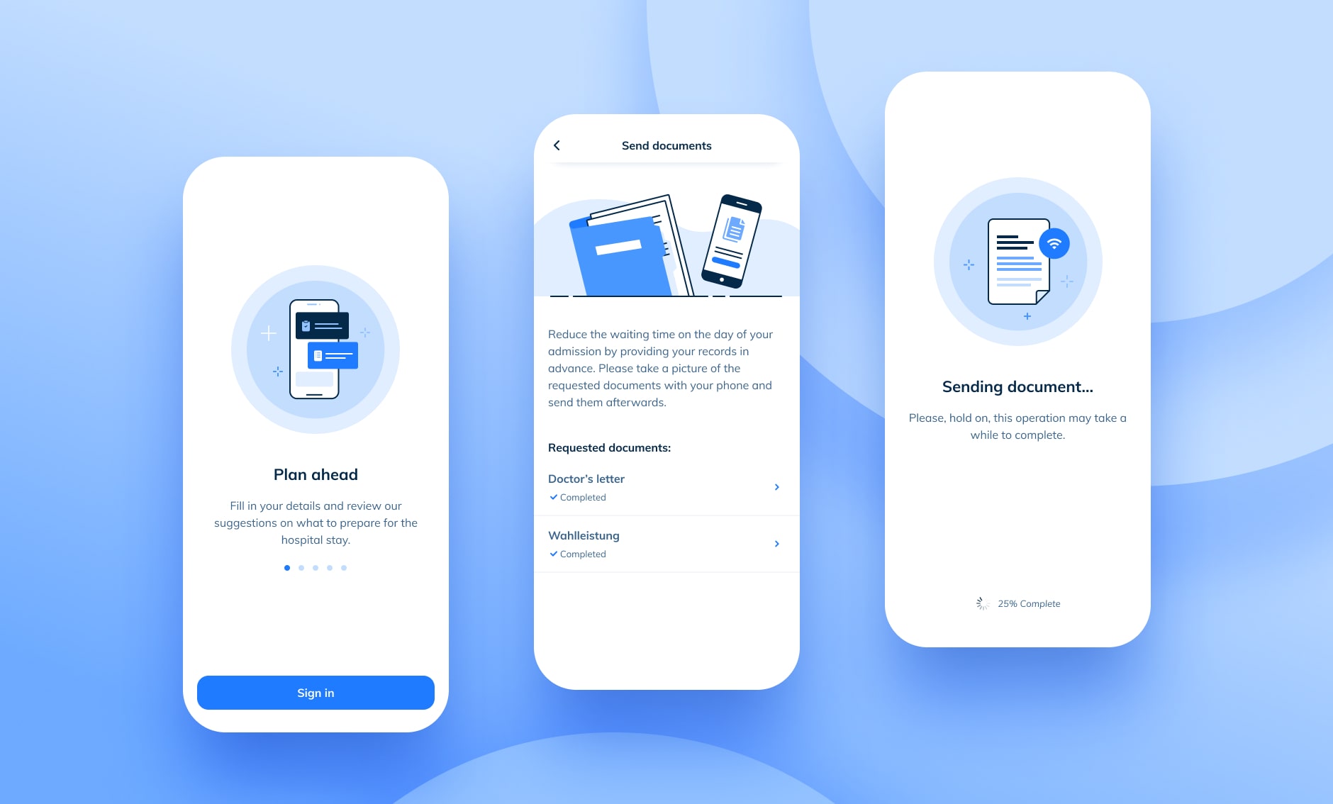
The application was still simple, and it didn’t yet need an extensive library of components. Nevertheless, the team could already foresee the need for certain variants. The image below shows only the most crucial components we personalised in order to make the app look unique and fully branded.
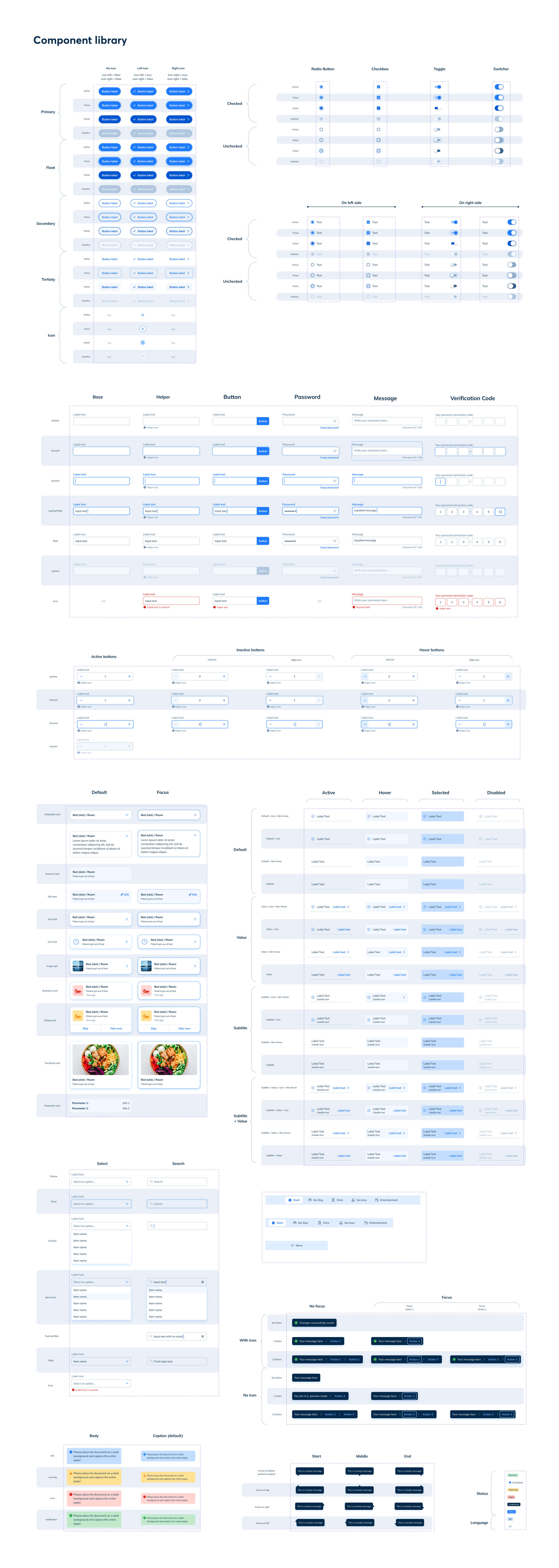
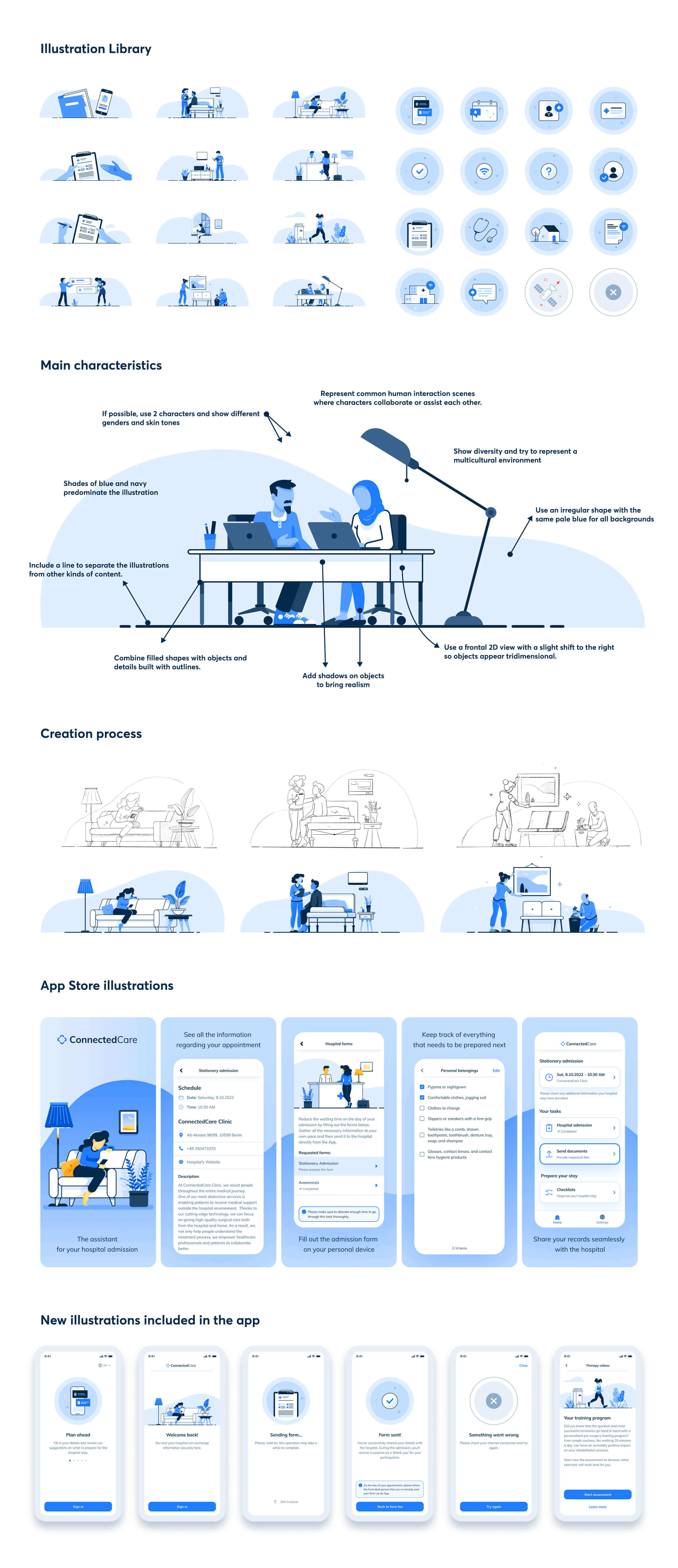
Besides the usual components, we also needed to create an illustration library. Illustrations have the power to convey complex ideas easily and support readers understand texts quickly. For a health-related app, it seemed impossible to move on without a set of images.
Adjusting the entire app
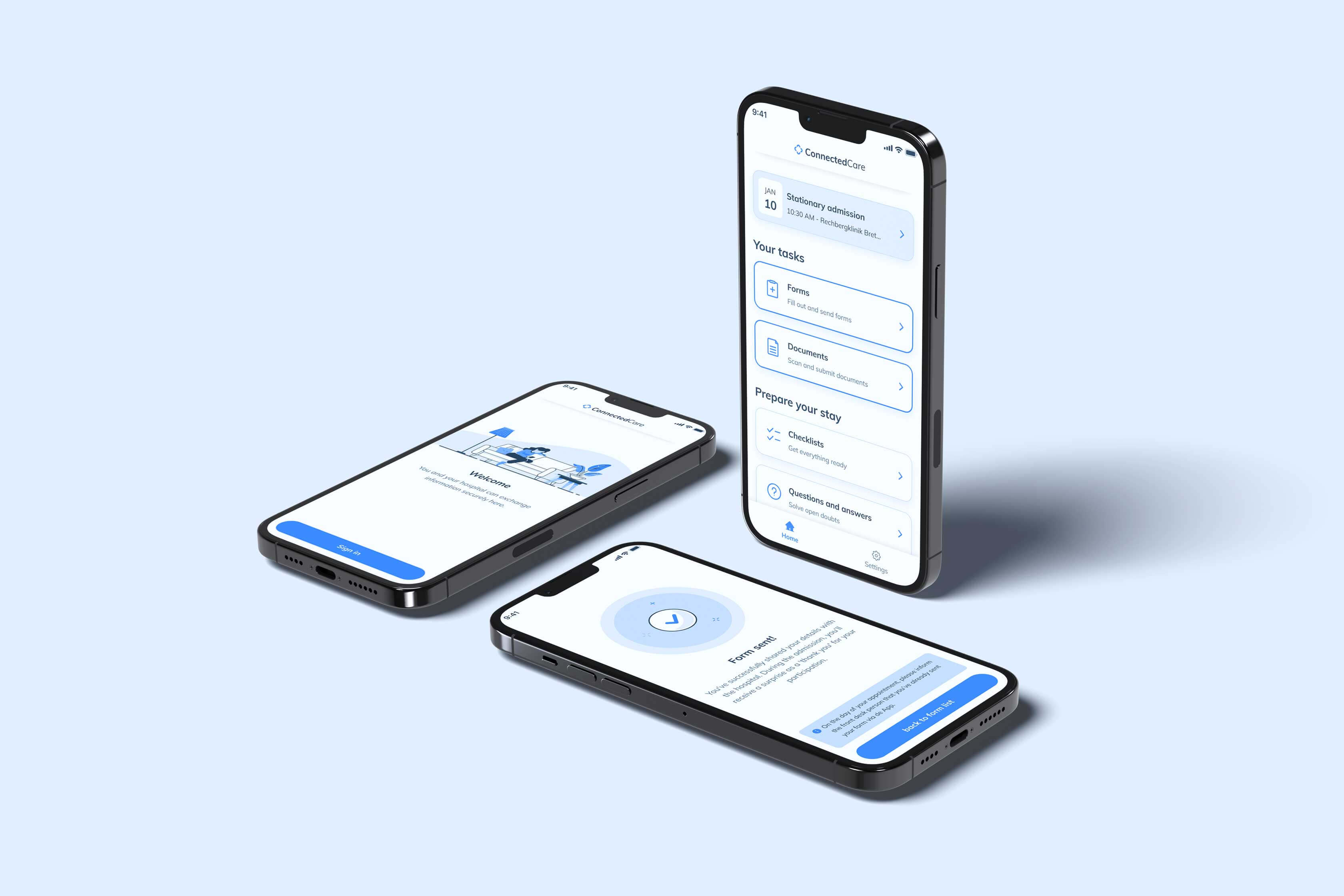
Creating the design system and adjusting the entire app happened synchronously. I often jumped back and forth between the app and the system to ensure both things were functioning well. So, it took some time to get things up and running, but after three months we were ready for the release. I should admit that it took up to 6 months to really feel like the design system and the app were truly coming to life, but we were making progresses very fast.
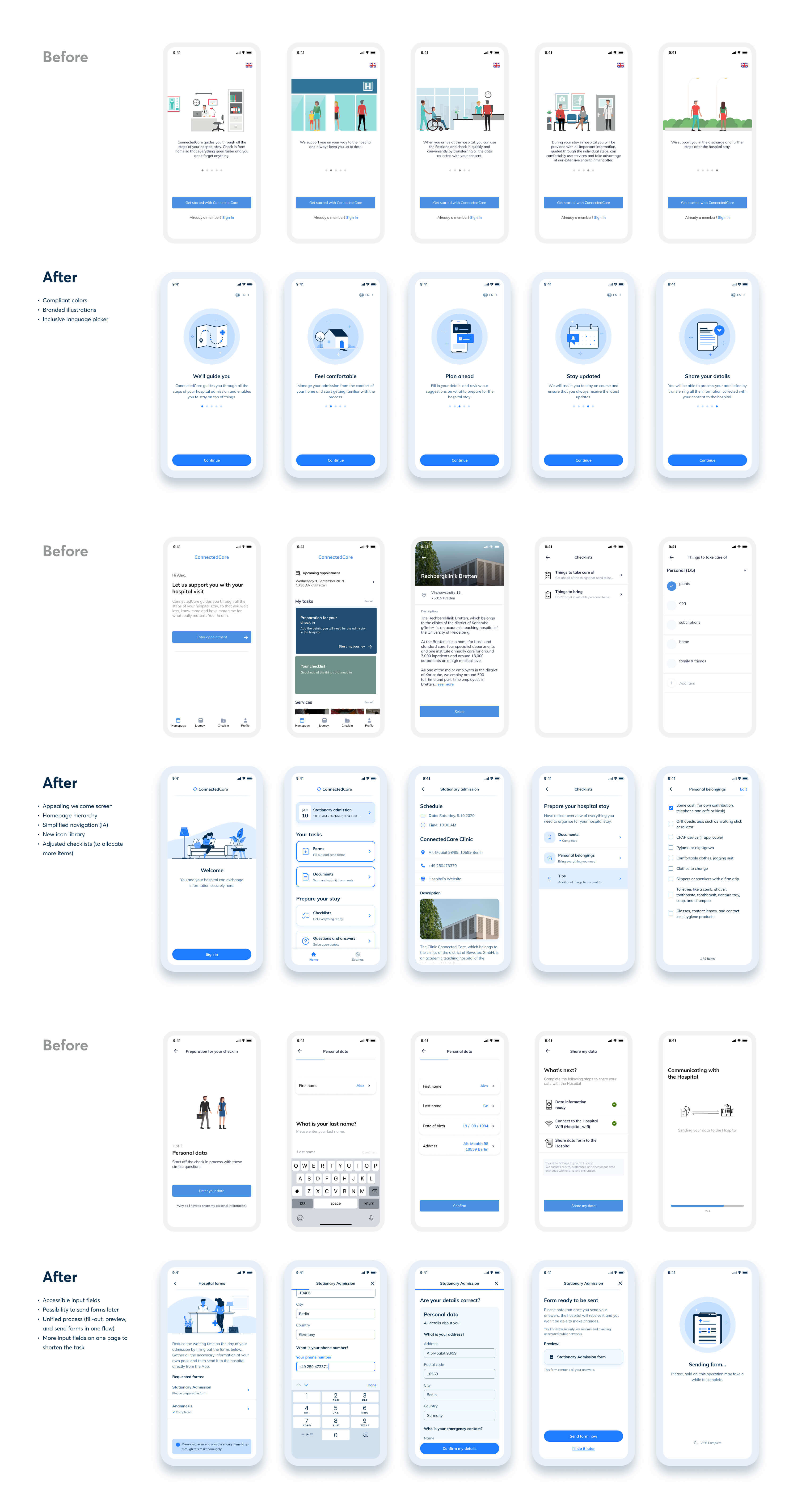
During that time and the following years in the team, I constantly worked on improving the UX, if you are interested in discovering how that process looked like, feel free to take a look at this project.
Project conclusions
Assembling a Design system from the ground up has been a fantastic experience and I reckon that working on a nearly blank canvas was a one-in-a-lifetime opportunity.
There were a few factors that contributed to a very rapid release. The team had plenty of space to explore the brand and the system, we had the support and understanding from the Marketing department, and the app was still in an MVP phase. After only three months of work, we were already prepared to expand the application and add many more functionalities.
I worked in the same team and product for 3 more years and that helped me understand a few things that I should take into account in my future design systems:
- A customized design system isn't suitable for every team: Sometimes it can be due to a simple budgetary reason, perhaps there is a management issue, maybe a team is low on resources, or a it's just a matter of being in a company that isn't design-driven. In any case, producing a tailored system is a highly collaborative and cross-department task where everyone should bear some responsibility. It essentially means more time invested in maintaining, updating, adjusting, revising, and creating the system. Not every team is prepared to undertake this commitment and, before making a decision, all stakeholders should discuss this matter thoroughly, including upper management. From a design perspective, the product can only be scalable if designers can fully understand the needs of the business and the expectations from the leadership team.
- Having a product strategy is everything: ConnectedCare was a new software created by BEWATEC, a company with a long career in building hardware. We started coding an iOS application within a market dominated by Android (Germany). By the time BEWATEC understood that the product should exist on both platforms, our teams and our internal resources were already too specific to adapt to Android. Creating an Android app meant doubling our team, restructuring the whole system, and hiring more designers. So, lacking a product strategy made us produce an infrastructure of resources that would soon turn obsolete.
- Design systems evolve constantly: even though it might sound pretty obvious, this was one of the most important takeaways from this experience. I always worked on the design system while also focusing on the UX of the application. Everytime I had to jump back to the atoms and molecules of the UI, I often said to myself "I'll change this one bit and then I'll forget about it". But, well, time showed me that this was never the case. I enjoyed having a versatile job, however, I realised that maintaning a complete design system is a fulltime task. If there aren't enough resources to sustain it, things will fall through the cracks before you can see it coming.
Related Projects
-
See project →
Document scanning feature
Product design -
See project →
Ada Health Website
Visual design -
See project →
Icon Set
Visual design