Website system
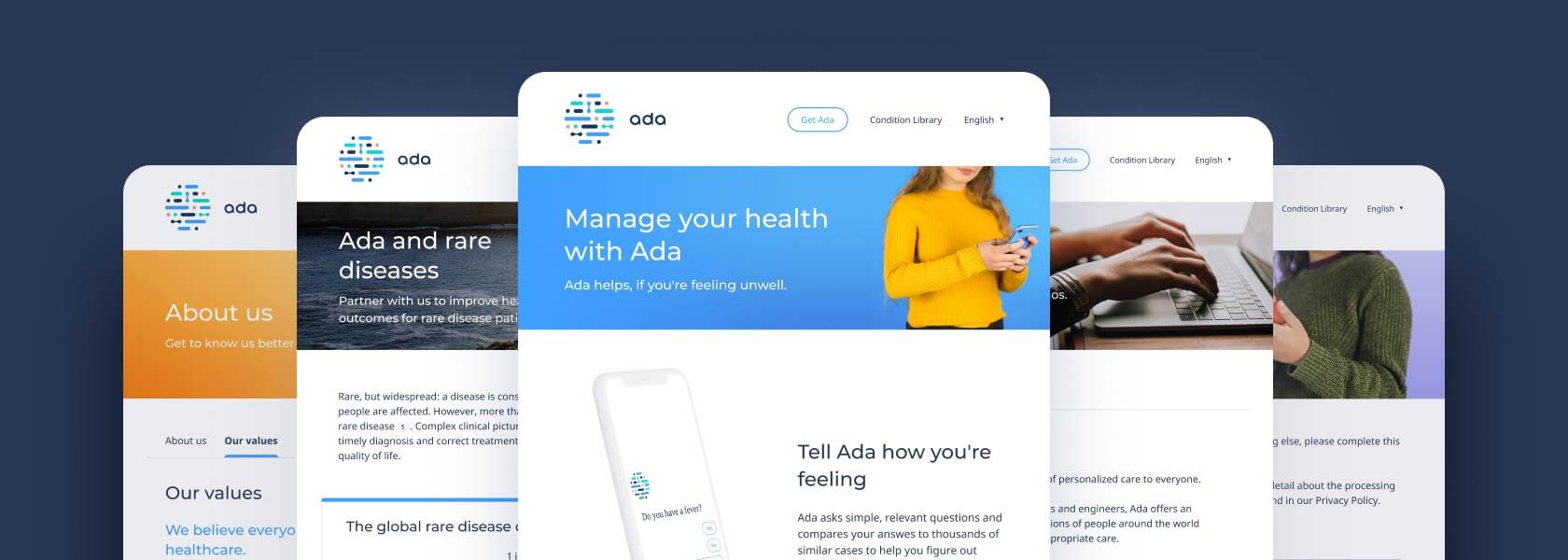
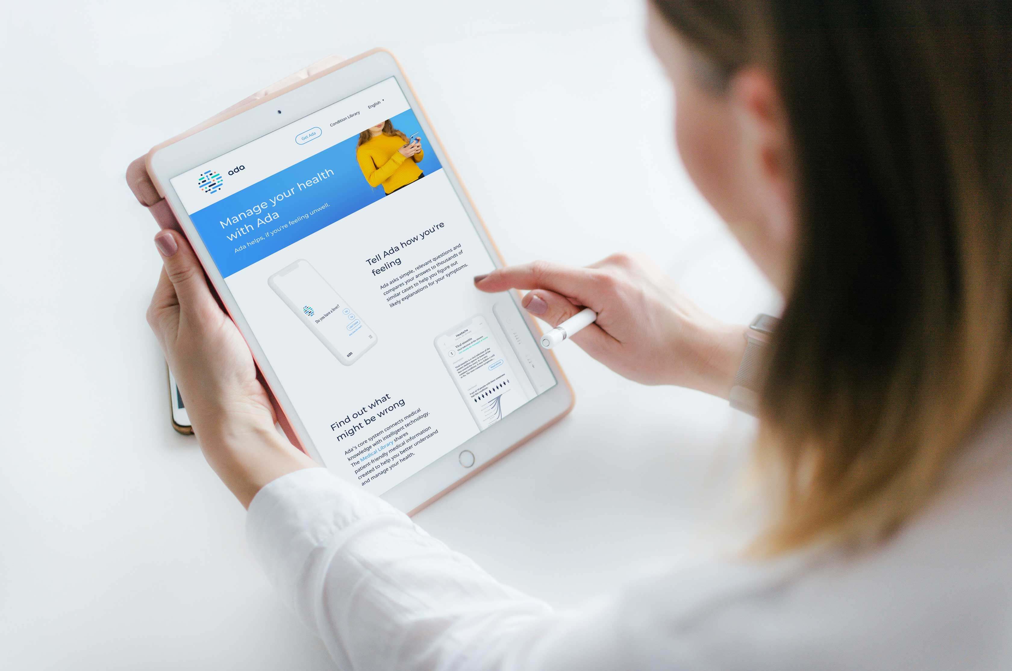
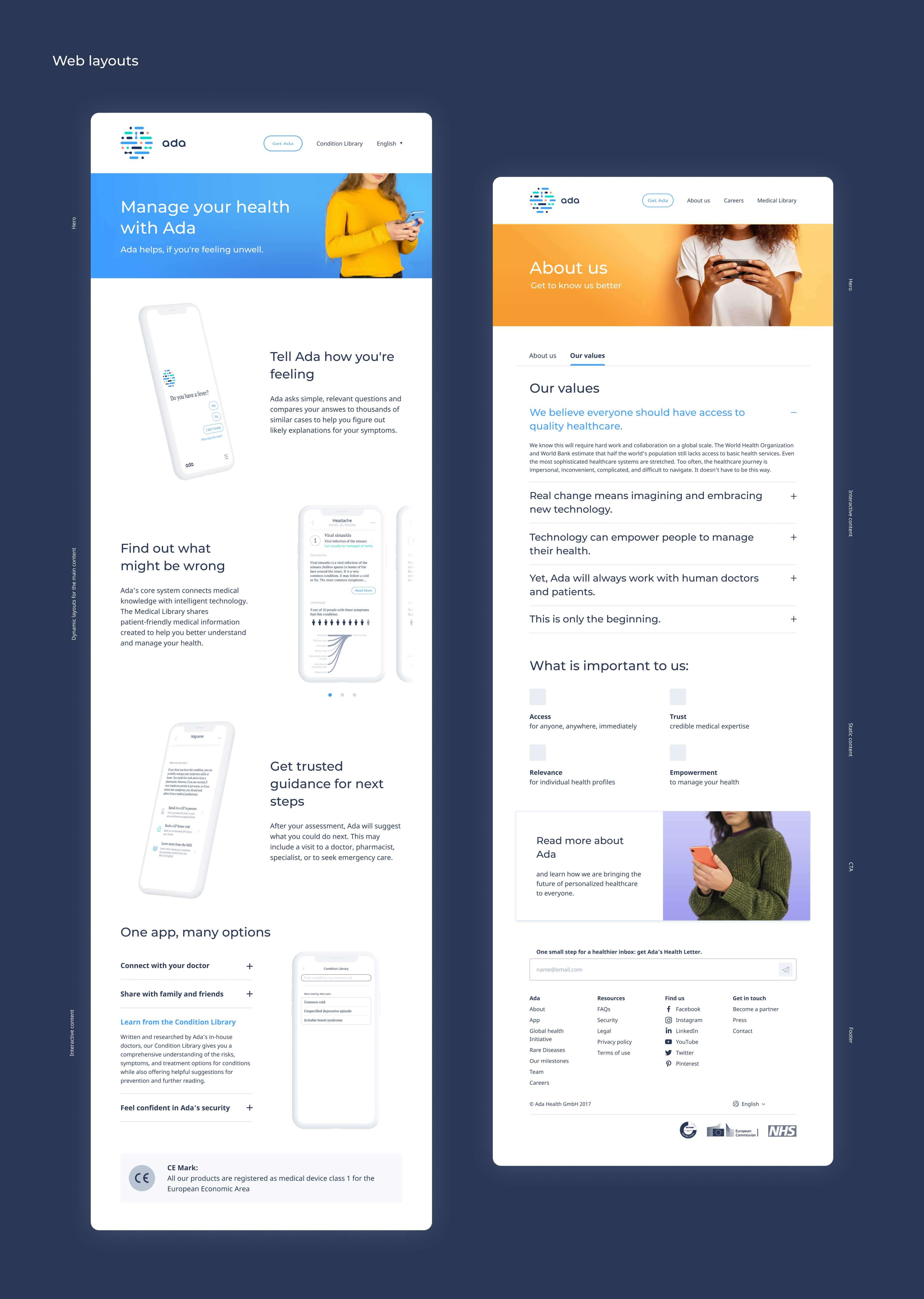
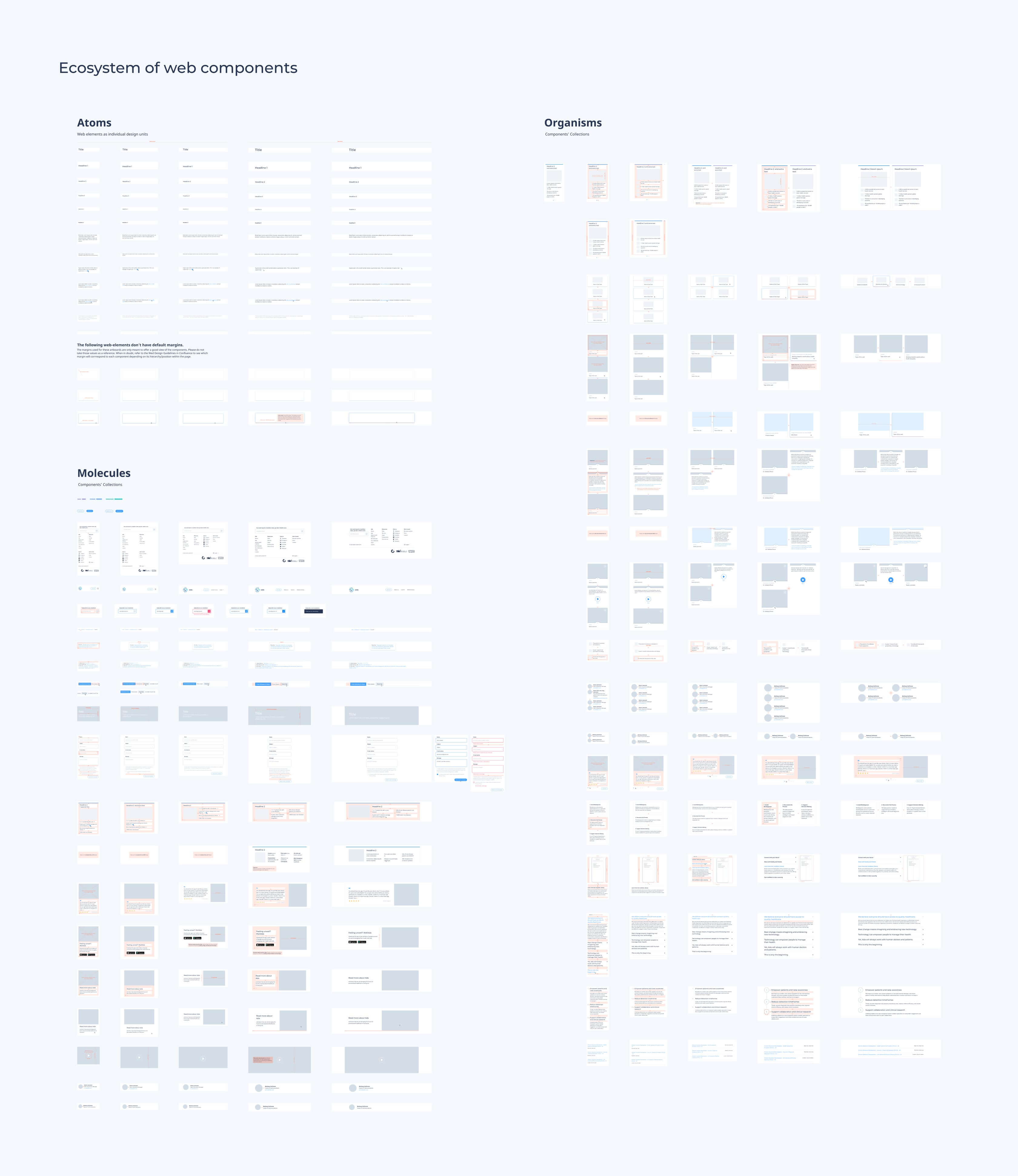
As a visual and web designer at Ada Health, I was in charge of creating and maintaining the first company-wide design system. This project allowed internal teams, such as Marketing and Product, to be in sync and to collaborate better.
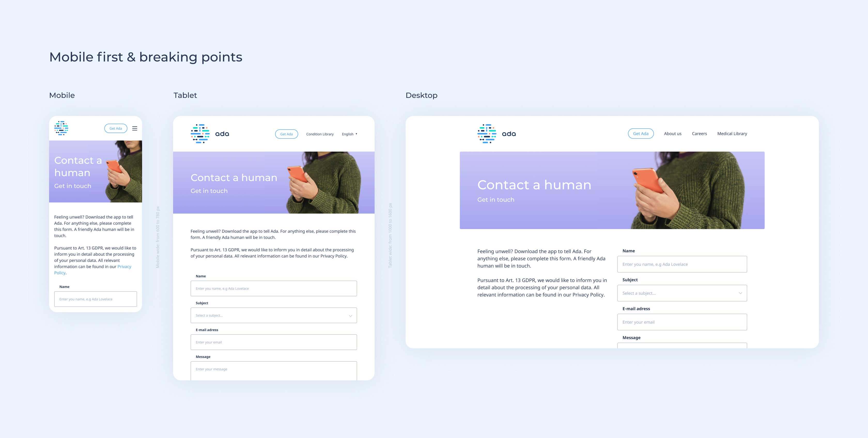
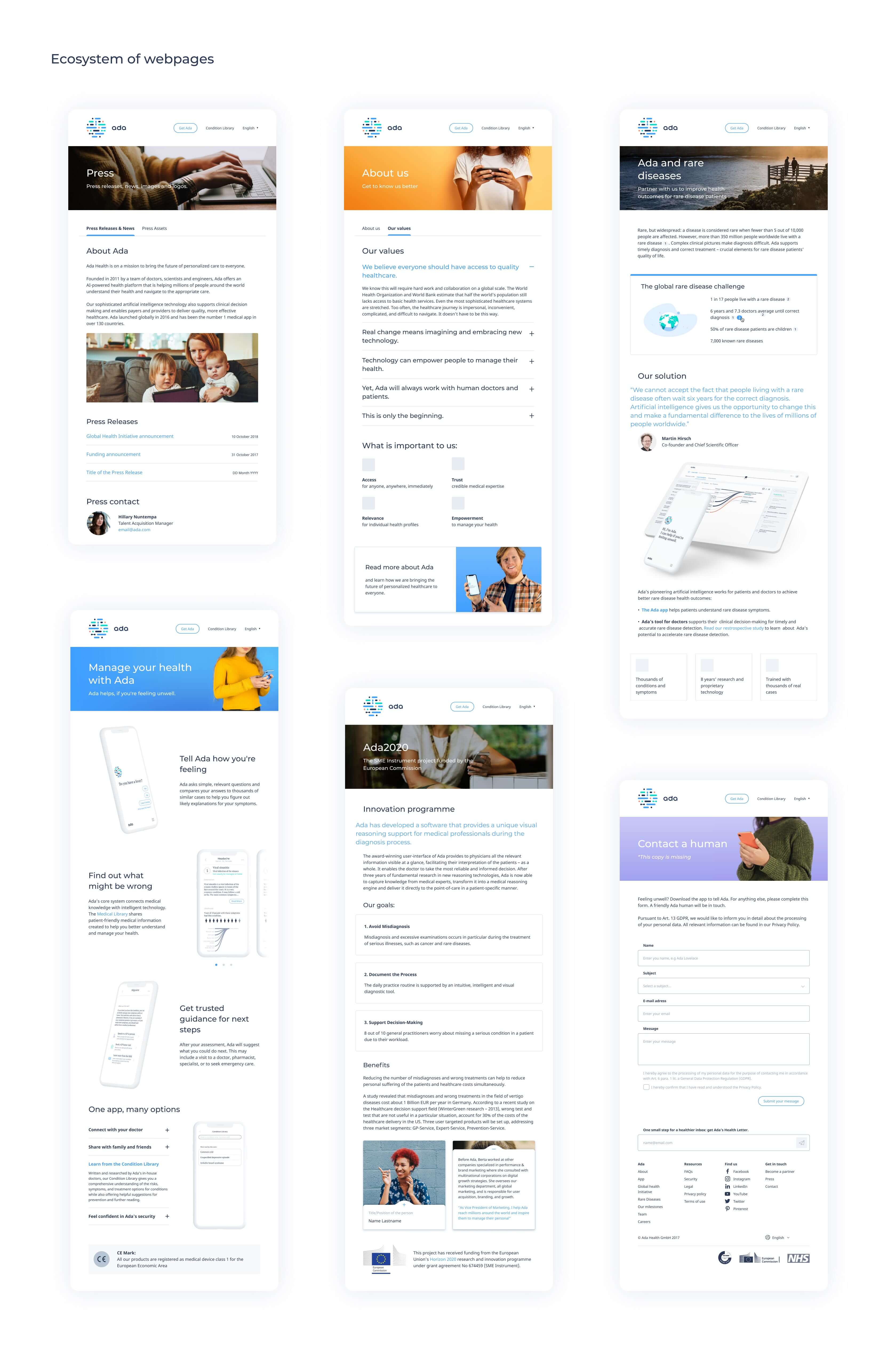
On the other hand, creating a new visual code became crucial for the success of Ada's website. Back in 2019, the entire web deeply lacked consistency, logic, and order (the two key ingredients to having a highly scalable product). Therefore, refreshing all those web pages turned into the ultimate test to verify that the system worked.
This project wouldn't have been possible without the endless support of the developers: Rupert Adlmaier, Fabian Schröder, Guillem Andreu, and Christina Anastasiou.
- Company: Ada Health GmbH
- Project field: Visual design
- Date: August, 2019
Project retrospective
Back in the day, the website team was low in resources and time. This situation ended up blocking our creativity and narrowing down our vision. Since the goal of this project was to unify inconsistencies and get rid of unused assets we had to often make complex decisions and recycle as many components as possible (even if we knew they were not fully functional).
What could have worked better? Even tho Marketing and product were cooperating, none of the teams succeeded at showcasing their progress and involving others in the process. There were many patterns that the mobile app and the website could have had in common. Consolidating those elements could have improved and simplified exponentially the overall user experience on all platforms.
Our relationship with the accessibility guidelines was a bit shy. We were very careful with our illustrations, always trying to depict diverse crowds. Additionally, we were checking that our colors and font sizes matched the general web guidelines, but we decided not to remove certain unaccessible elements not to endanger the brand.
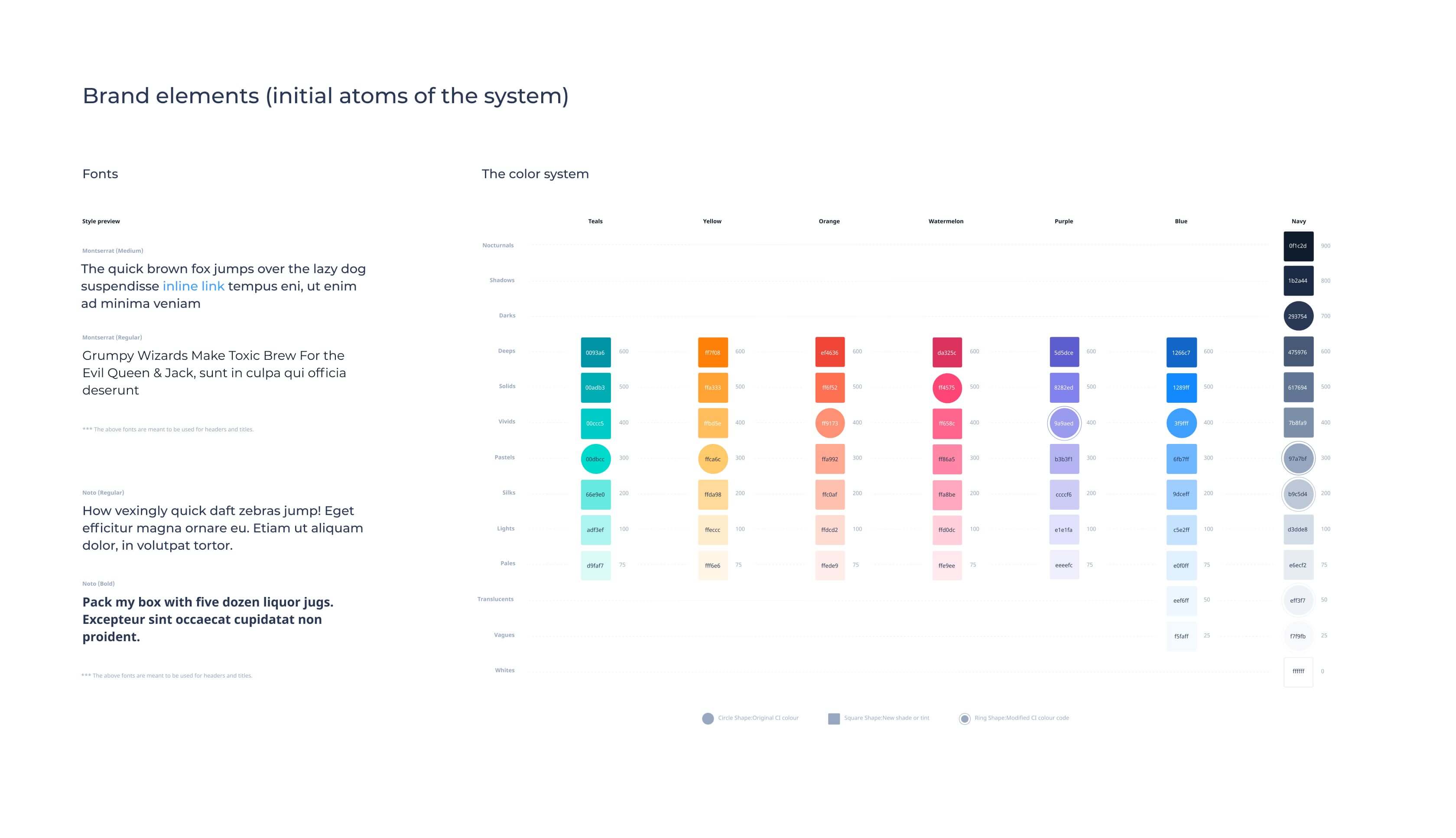
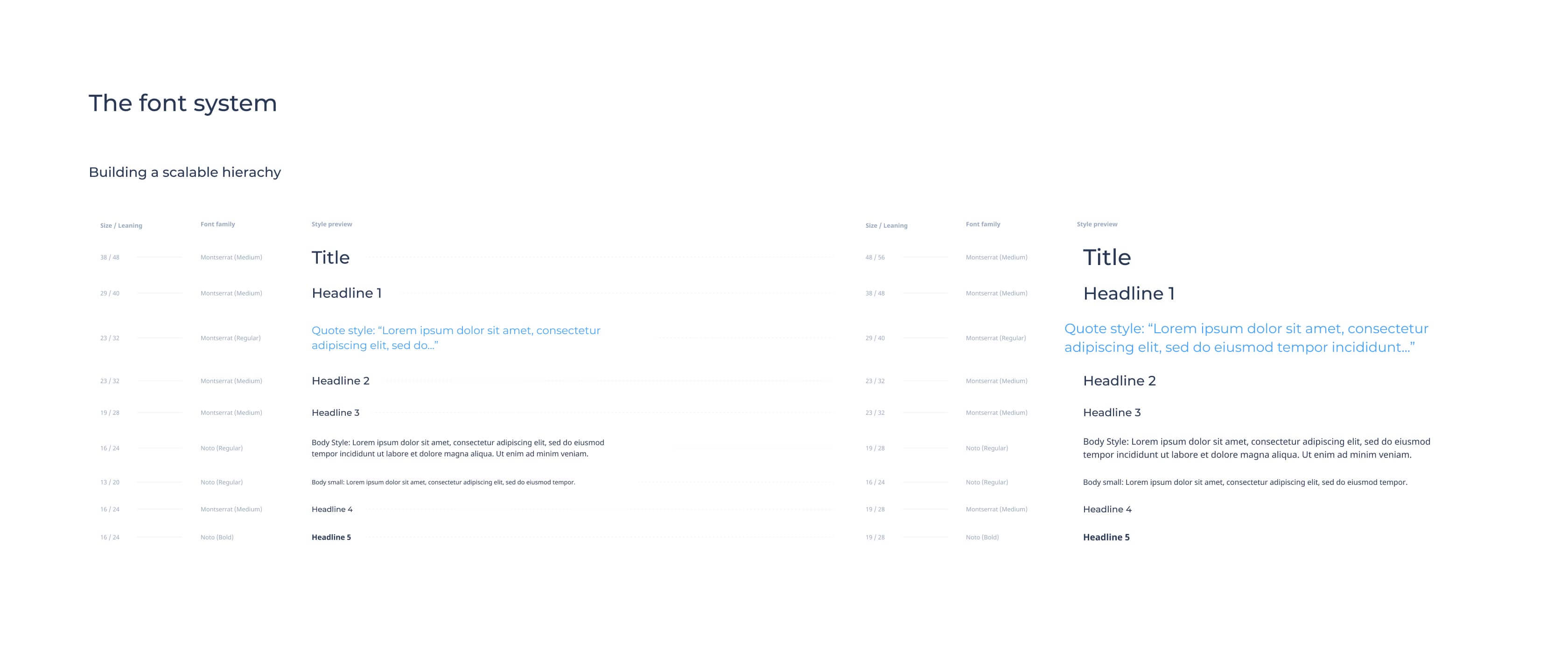
My personal conclusions: Working on the creation of the first design system on such a developed website was both very challenging and rewarding. We had about 6 months to unravel the knot and, with this time, we managed to develop a fully operative 3-sizes icon system, a common font library (shared with the main product of the company), and a fully working website. However, if I could rewind, I would allocate more time to test the website, unify more components, and raise awareness about the importance of constantly maintaining a system.
