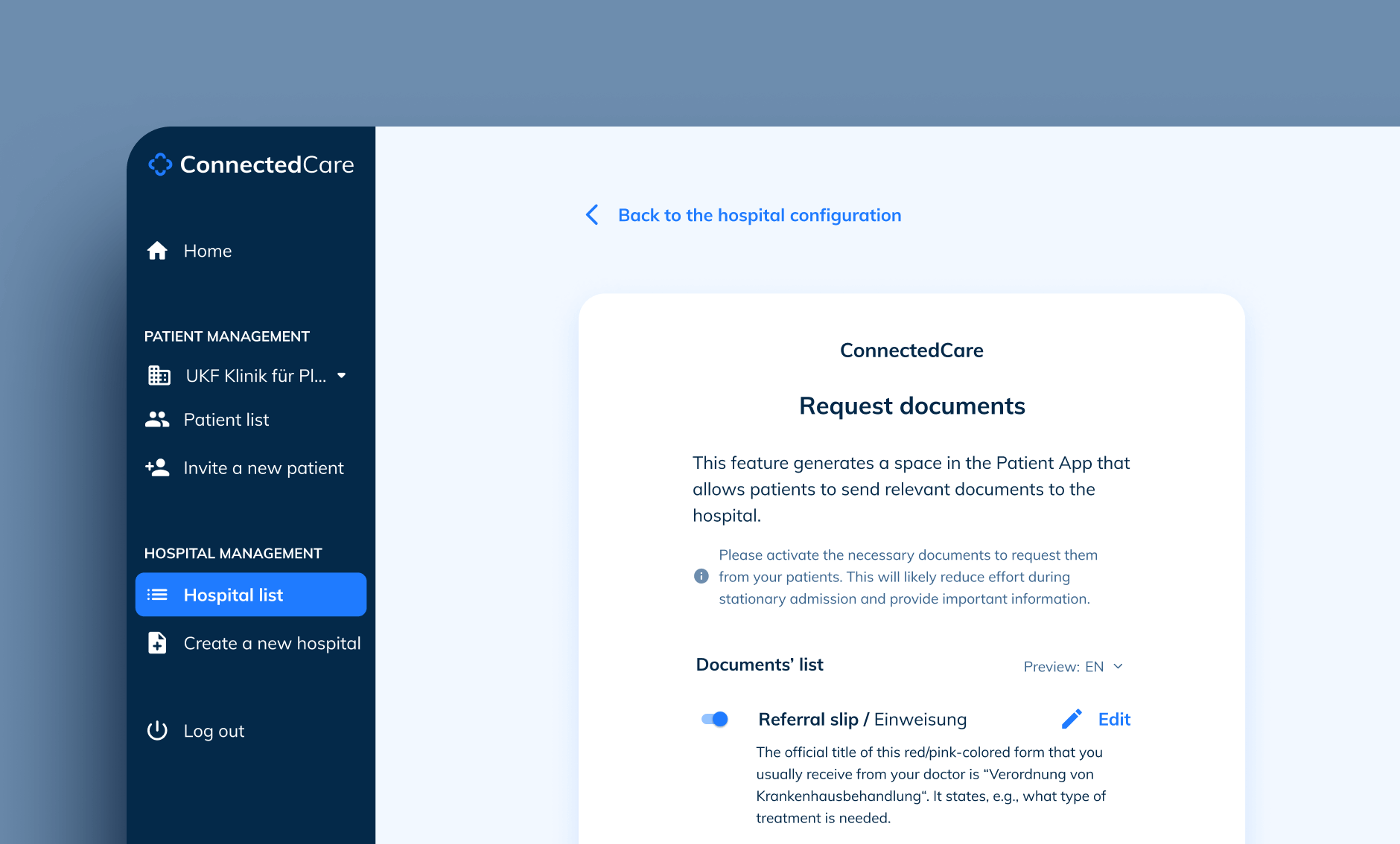
Document scanning feature
At ConnectedCare, the main goal is to build easy-to-use products for patients and clinics. One of the central products is the so-called Patient App, a mobile application that allows hospitals to keep patients on course with their upcoming medical treatments.
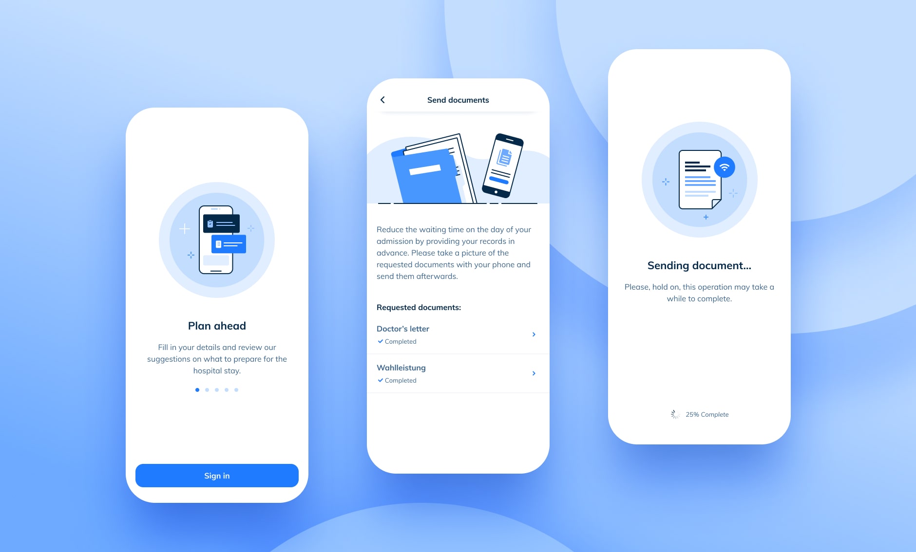
During the admission phase, many hospitals ask patients to bring loads of documents, which results in slower processes and additional stress for everyone. The ConnectedCare team created a new feature that allowed Hospitals to request all files beforehand so patients can scan and send everything through the App.
Specifications for the MVP:
- Avoid 3rd party integrations.
- Create a "Document sending" entry point in the App.
- Patients must take an instant picture to avoid corrupted files.
- Patients cannot delete any requested document.
- Possibility to edit a document scan before sending it.
- Patients forward each file separately.
- Patients can send documents at any moment.
- After the upload, users see a timestamp confirmation.
- After the sending, changes aren't possible.
- Company: BEWATEC ConnectedCare
- Role: Product Design lead
- Date: June, 2021
User context
The information below is a mix of data gathered through user interviews, user tests, patient surveys, and direct hospital feedback. The user personas represent two crucial segments: public health patients vs. privately insured users.
1. JACK BURNS
Current location: Holiday appartment
Mood: Quite relaxed (due to his chronic condition he knows the process well). Since he has no internet during his trip, he will finish everything once he is back home.
Stage: Pre-hospital: he will go through the hospital admission in a couple of months.
Patient type: he has a private insurance.
Pains:
- His disease has shaped his lifestyle.
- His health status worsens over time.
- He has to go through these medical processes constantly.
- The prospect of never being fully healthy.
- His condition is a silent burden for relatives.
Needs:
- Avoid annoying tasks and get them out the way as fast as possible.
- Distraction
Motivators:
- Be with his family and grandchildren. He wants to make the most of his time and not be a burden to his daughter.
- He understands the process and trusts the experts: he prefers not to think much about his situation and let the doctors do their job.
Behaviors:
- He relies a lot on his doctors and follows their suggestions blindly. When in doubt, he seeks advice in his family.
- Besides the strcitly necessary treatments, he doesn't do an extra effor to stay healthier as he feels that has no direct impact on his situation.
2. CECILE TONE
Current location: Home, sofa
Mood: She is slightly stressed about the upcoming appointment. It is the first time she needs surgery, but she is somehow confident that she will manage to prepare everything for the sick leave.
Stage: Pre-hospital: she’ll do the hospital admission process just in a few days.
Patient type: publicly insured with scheduled surgery.
Pains:
- She isn't familiar with the situation
- She is afraid of the treatment
- She is worried she will do something wrong.
- She is unsure everything is going to be alright after treatment.
- She is always stressed and under pressure.
Needs:
- Know what to expect before and after the procedure to plan her life accordingly.
- Automated processes and get things done ahead of time.
Motivators:
- Doing what's right for her kids is the most important thing in her life. She wants to stay positive and energic for them.
- She wants to be productive, effective, and helpful, so she tries to be up to date and well informed with anything regarding her or her family.
Behaviors:
- She has good habits, takes Zumba classes weekly, eats healthy, and visits her GP regularly.
- She's always on top of things. She likes to have a stable and organised life to reduce unexpected susprises.
Benchmarking
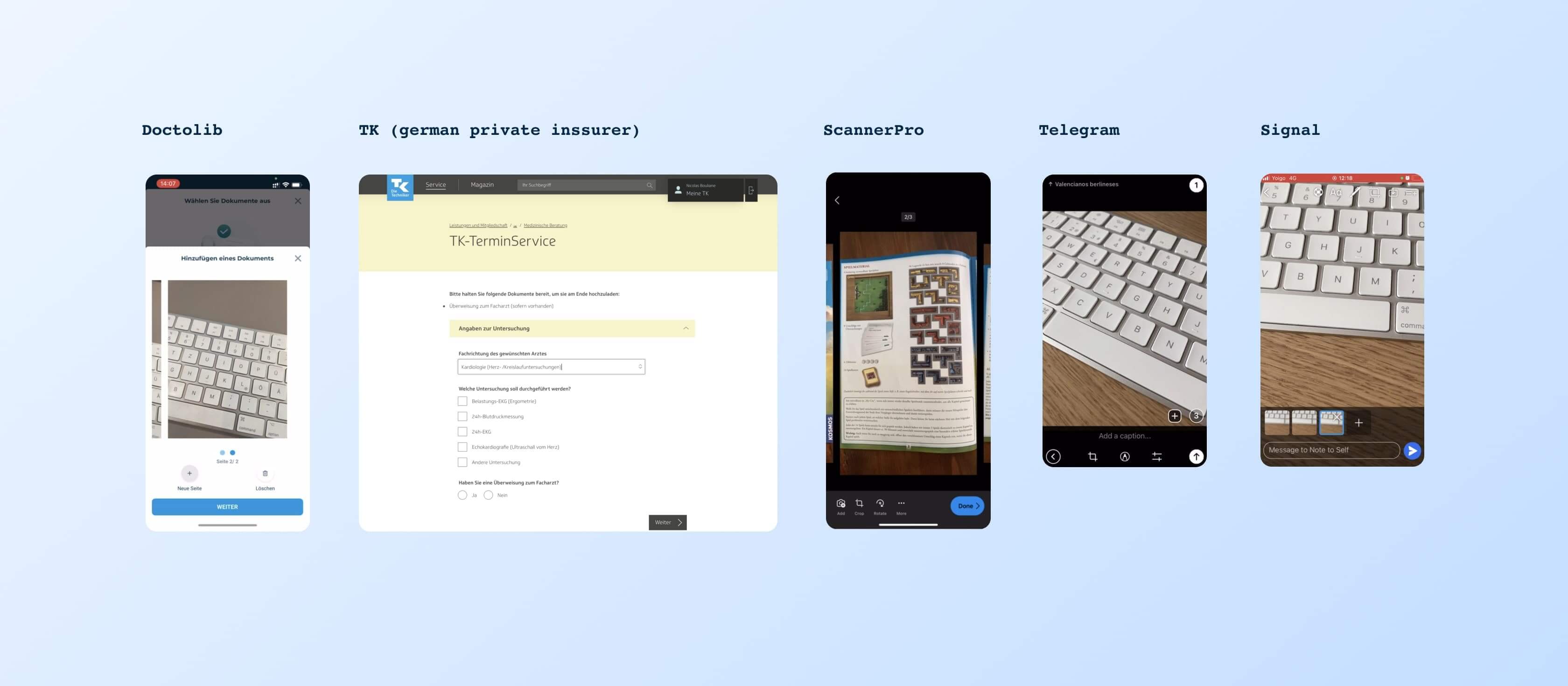
We initially studied how our user group would utilize our competitors’ products (and other types of document scanners) to complete the task:
- Most applications have an automatic image recognition system that trims and possibly adjusts the quality of the final image.
- Users can add and delete as many pages as necessary.
- Some systems allow for users to upload already taken images, however, we know this is not a secure approach for hospitals and we’ll dismiss this possibility.
Thanks to our analysis we understood that we needed to add a few requirements to our initial MVP list:
- Produce a multi-page scanning functionality (not to overcomplicate the first technical implementation we’ll add this feature in the second round of changes)
- Users should confirm that the pictures are correct before sending them.
- Patients need to deal with a lot of paperwork, let's add thorough document descriptions.
- Add reminders to help users get this task done before the admission day.
- Through research we’ve seen that some documents are applicable only for privately inssured people, so we’ll make those optional intead of mandatory.
App status and first thoughts
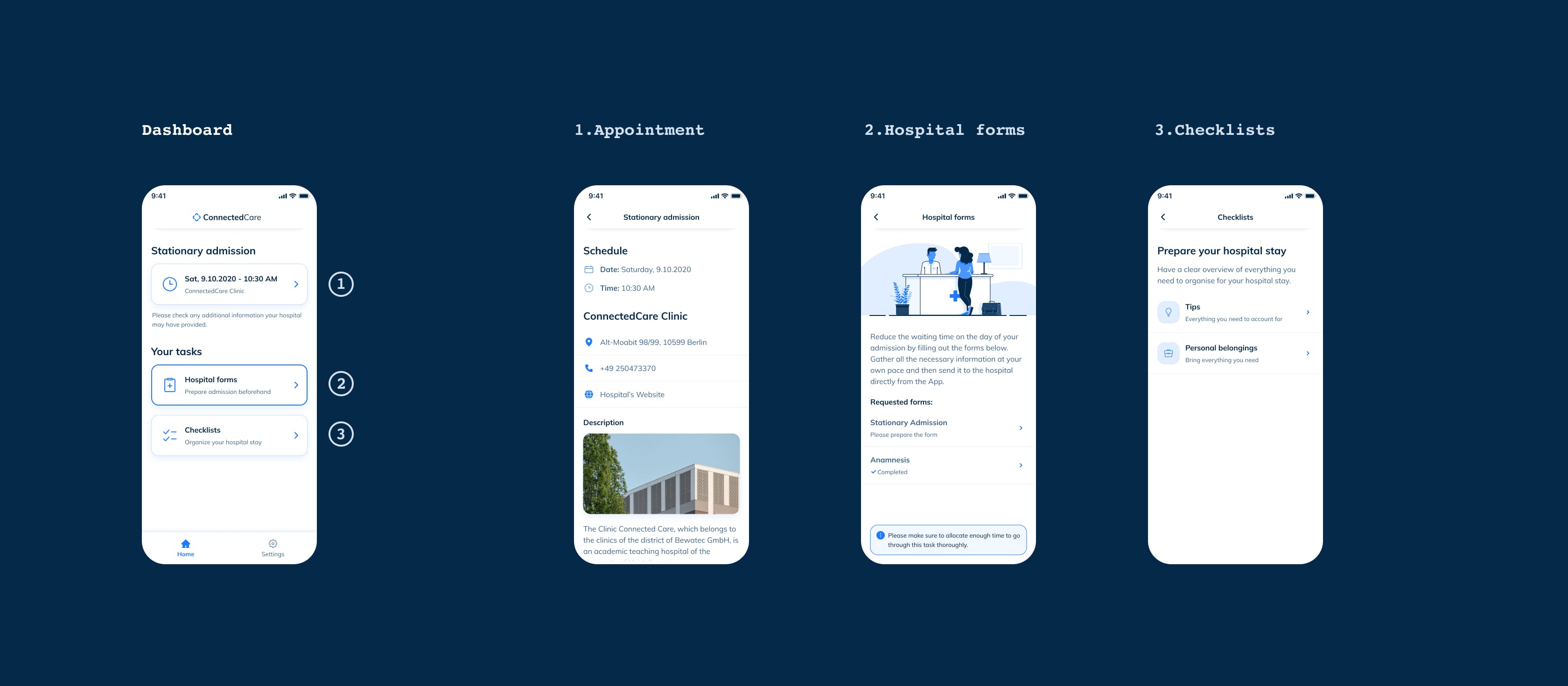
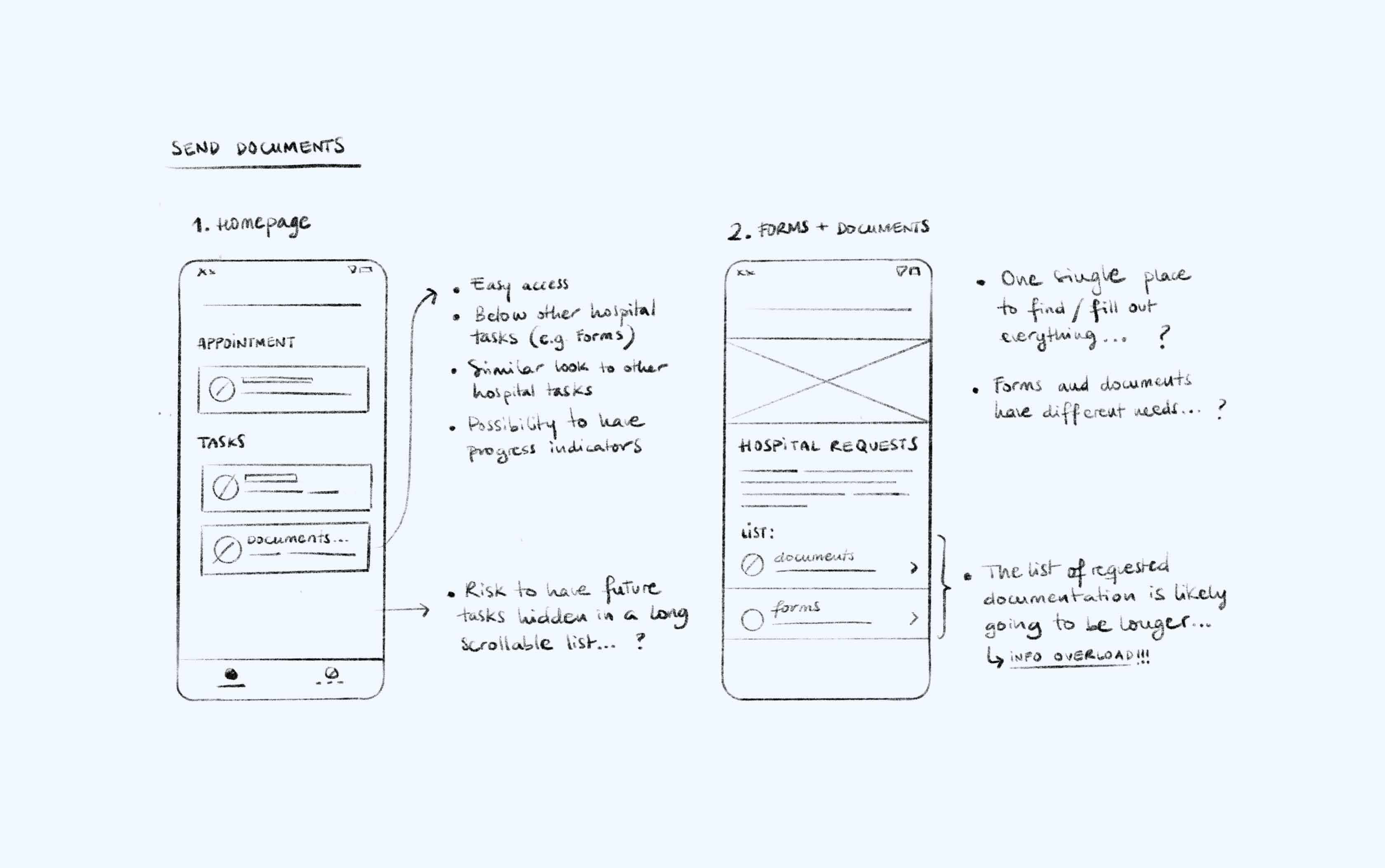
One of the first things to determine was the new feature's entry point. At that moment, the mobile App had just a few categories on the homepage: the appointment information, the preparatory checklists, and the admission questionnaire.
Proposal 1, we evaluated the possibility of having the questionnaire and the document tasks separated. Our research suggested that hospitals are very likely to ask for more than one questionnaire depending on the type of treatment. On the other hand, the initial briefing of the project was to allow patients to send more than one type of document.
Proposal 2, since the team was still very new and we were unsure of our capacity, we wanted to generate a proposal that could ease the implementation. So, we created an alternative path for users to have all documents and questionnaires living in the same space. Even tho this option was very convenient for us, it produced a weak and unsustainable user experience.
CONCLUSION: having these two assignments (documents and forms) organized as different spaces seemed to be the most efficient, structured, and flexible solution in the long run.
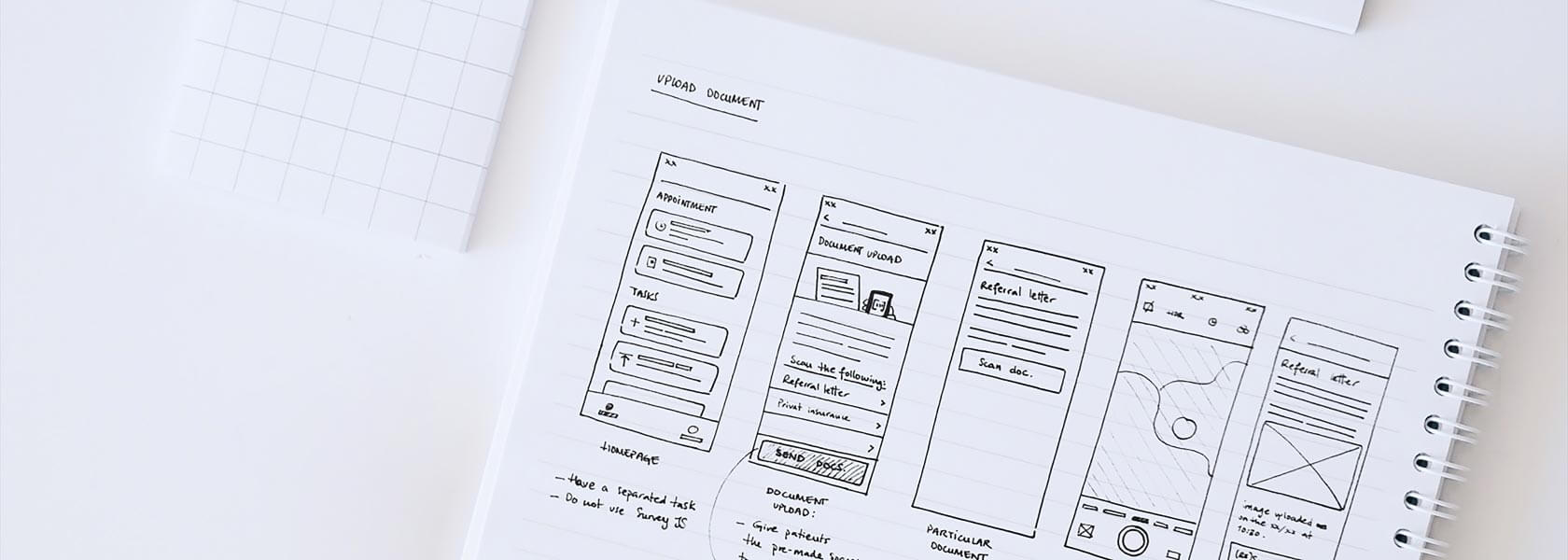
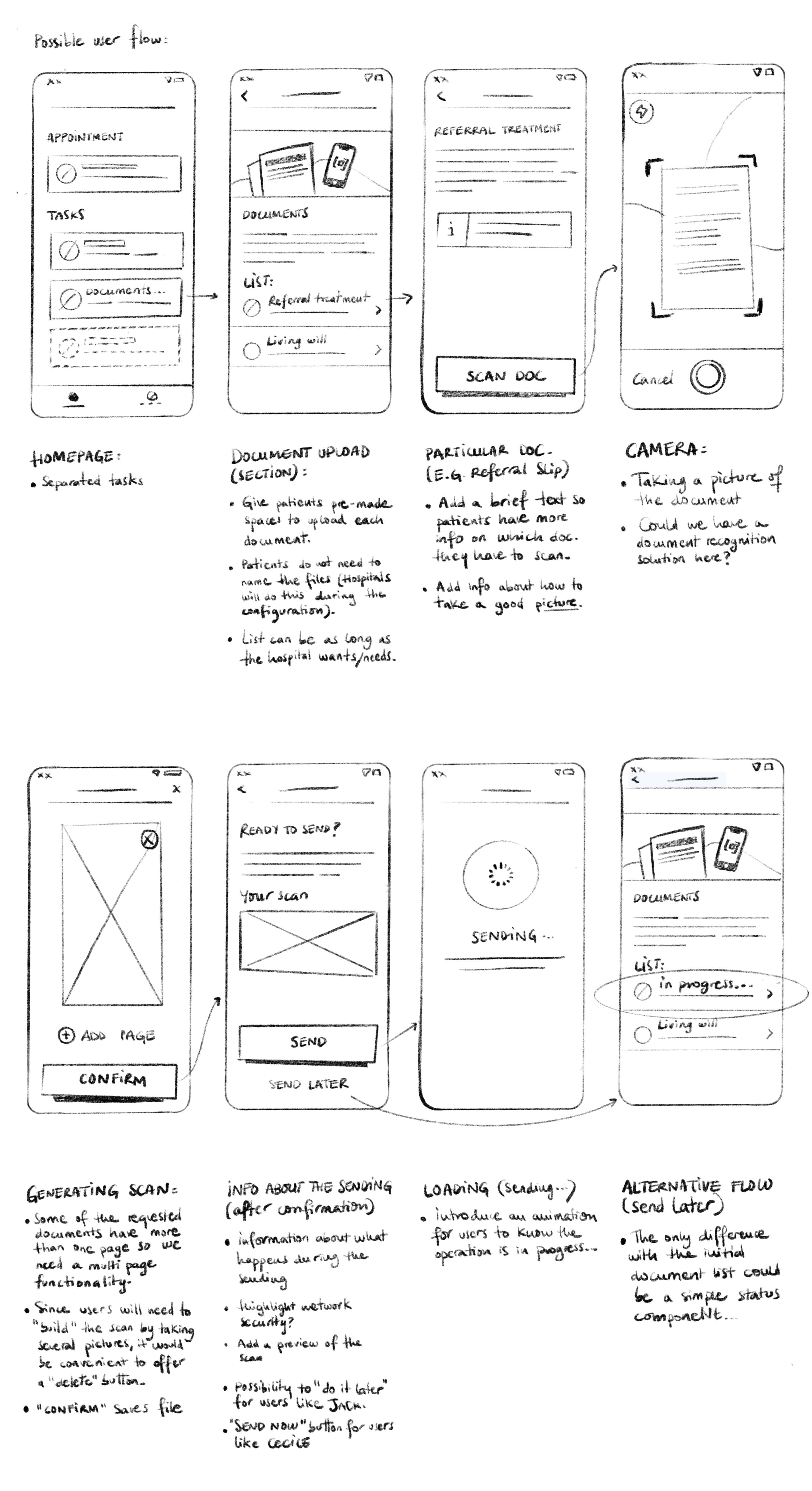
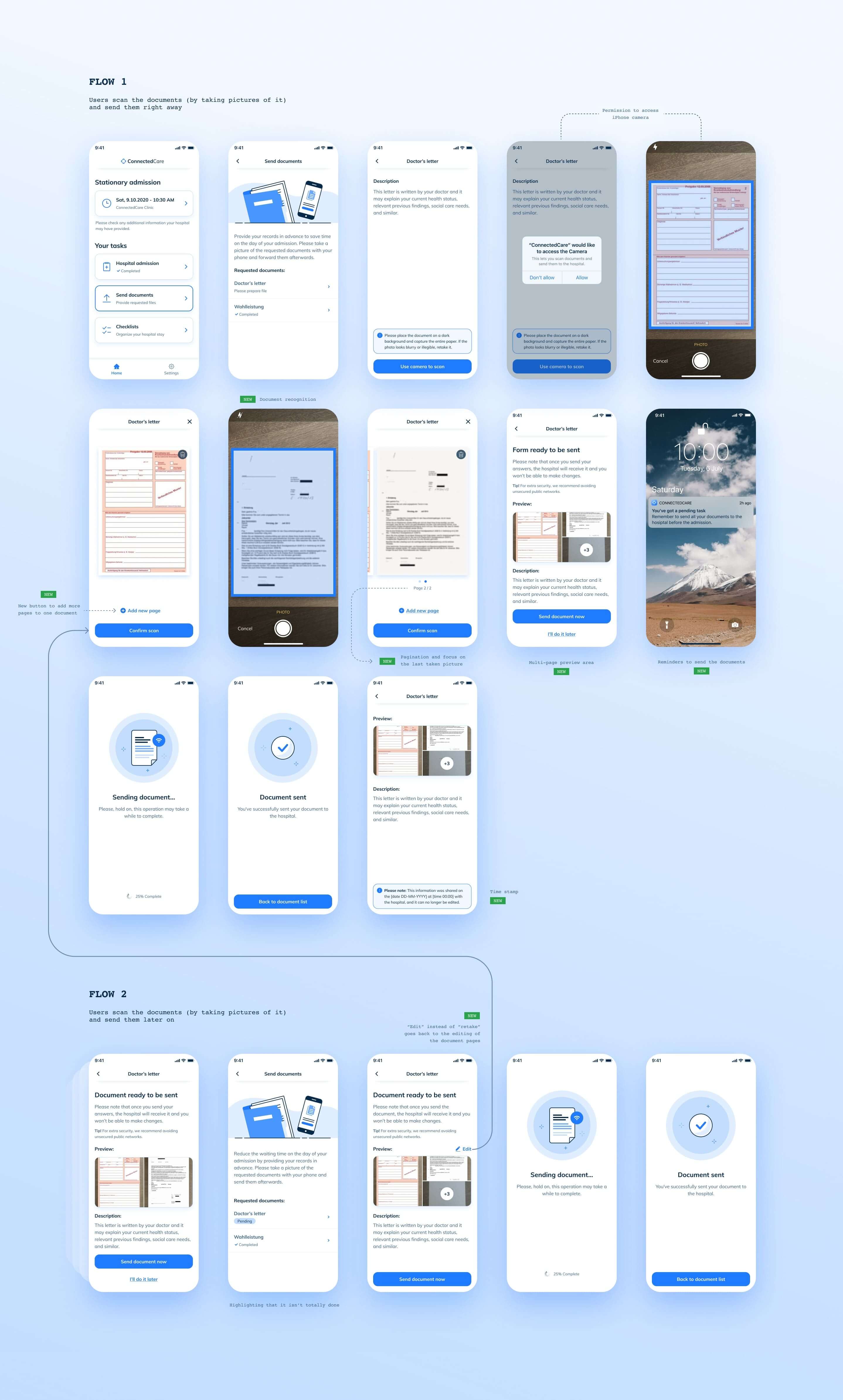
Sketches of the user flow
Wireframes and prototype
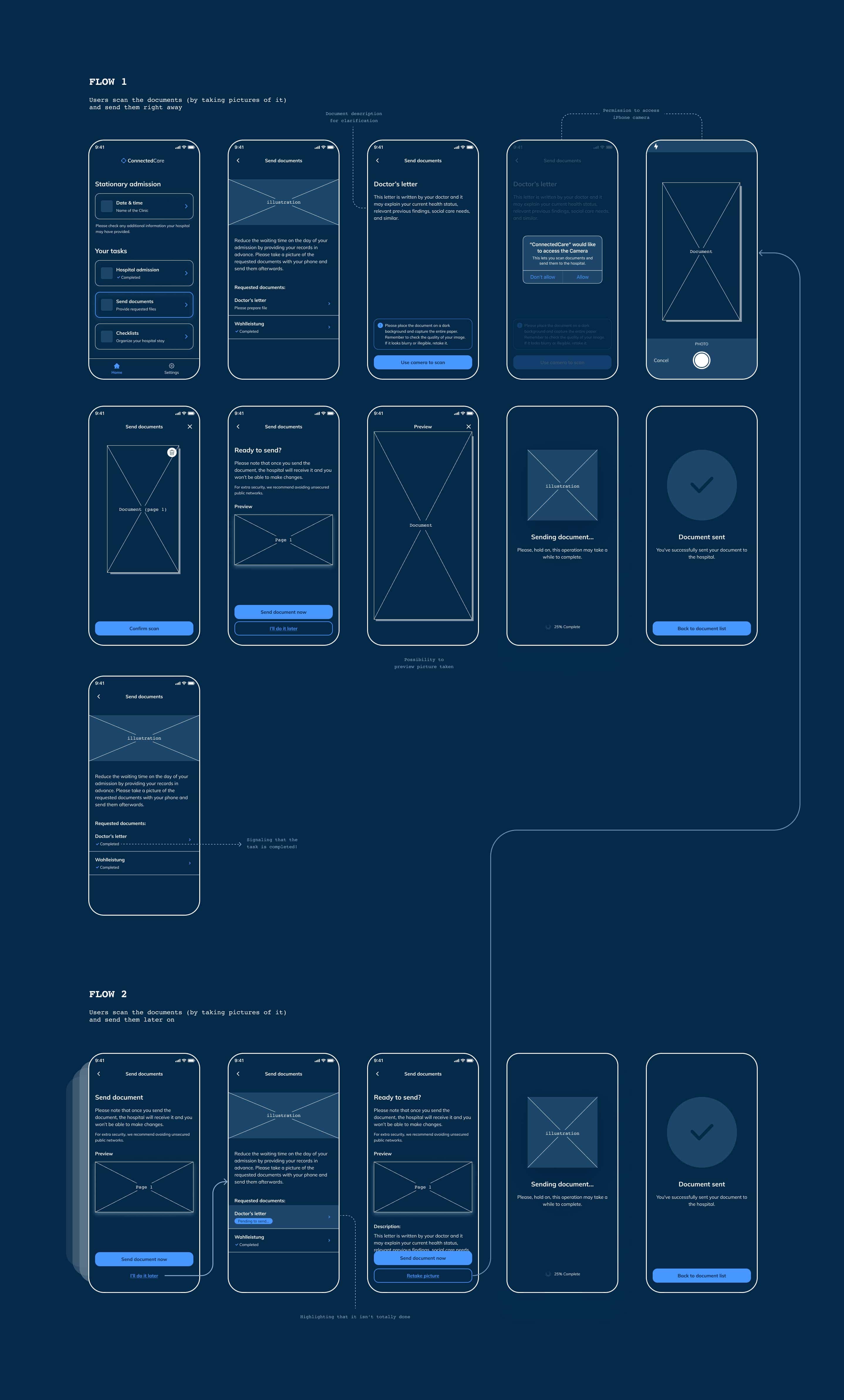
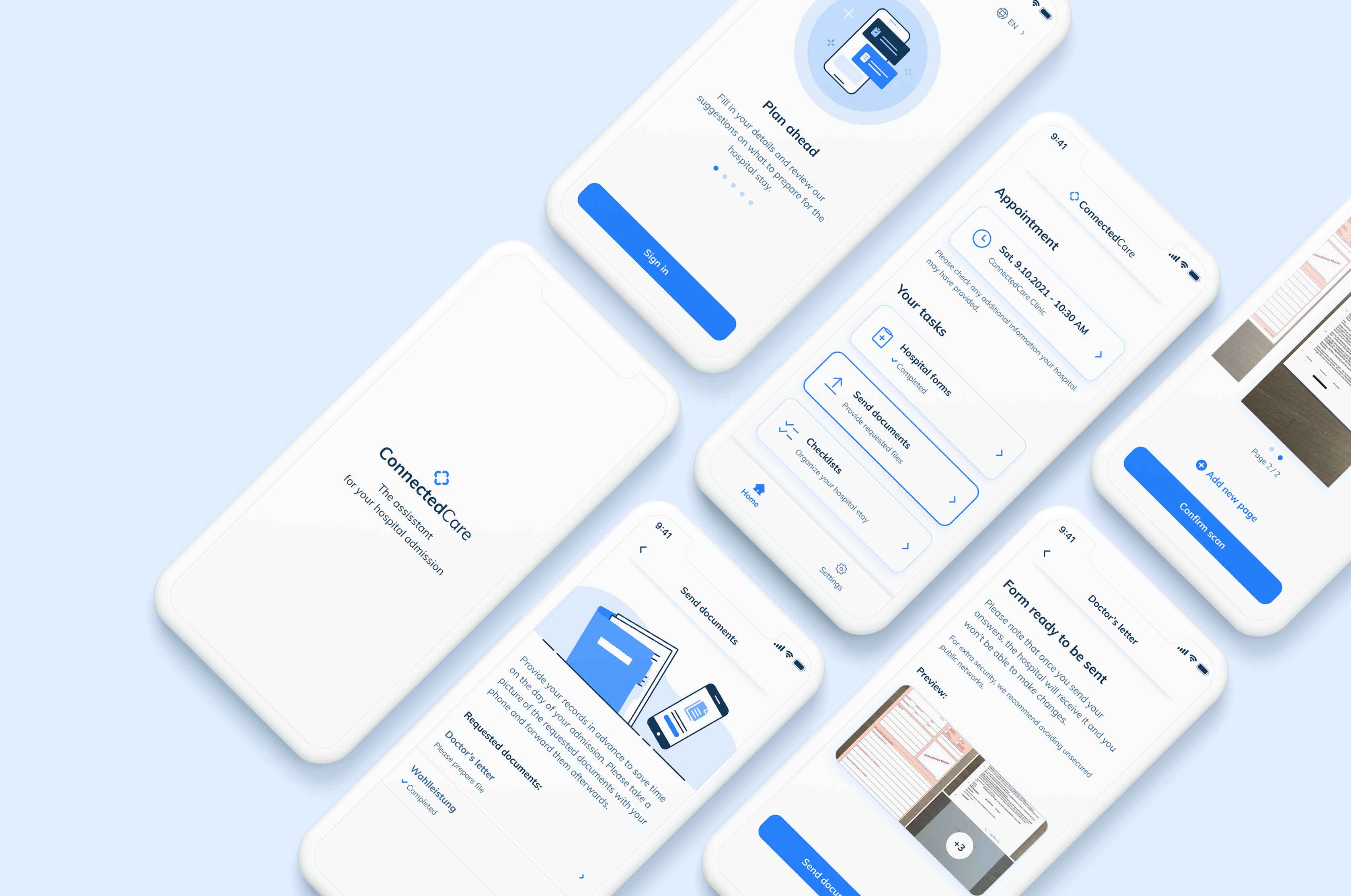
I often like to work with prototypes to share the initial ideas and flows with the engineers. My experience made me understand that prototyping can be a strong tool to communicate changes, run sort of internal user tests (before the real user tests happen), and get a clear idea of what needs to be done. You can see the final prototype in Figma.
User testing
Considering, the most valuable insights from the user interviews and tests, we ended up with these prioritary points to solve:
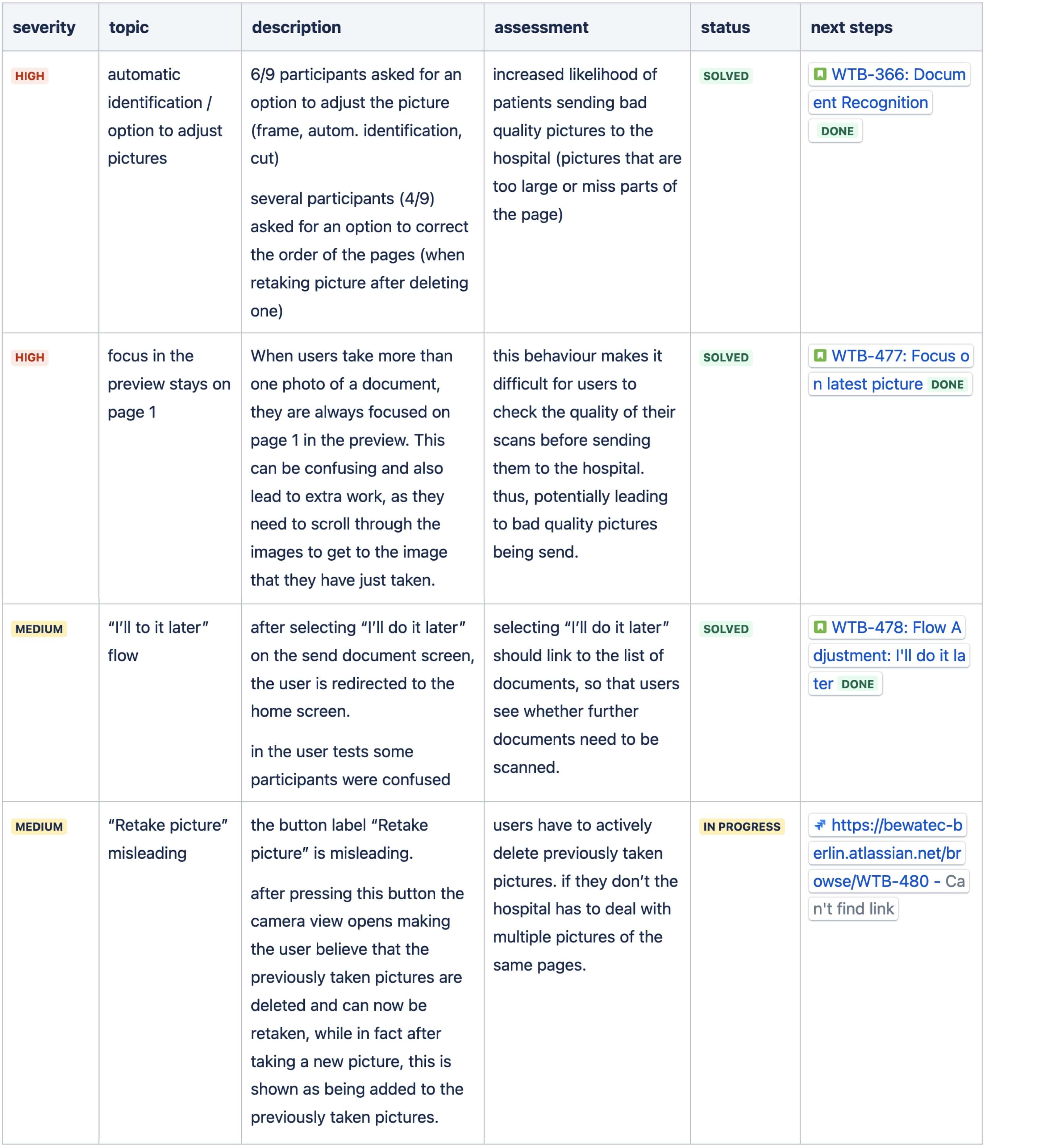
Final solution
Our newly designed feature showed that 90% of patients using the app managed to complete and send their documents to the hospital. We also received positive feedback about the app's performance from both Hospitals and users, which shows the new design was functional and easy to use. Mission accomplished!

Project retrospective
Looking back at what we achieved, we could say that this was a success story. We supplied the client with a solution that covered all their needs. We improved the patient journey and decreased stress provoked by the sometimes blurry and unsettling admission process. We rolled out the new feature relatively quickly with no major blockers or issues to report. It sounds pretty well, doesn’t it? However, I would like to take a moment to reflect more in-depth on our performance as a team, our development methods, and other aspects we could improve. Let’s take a quick look at the triple diamond first:
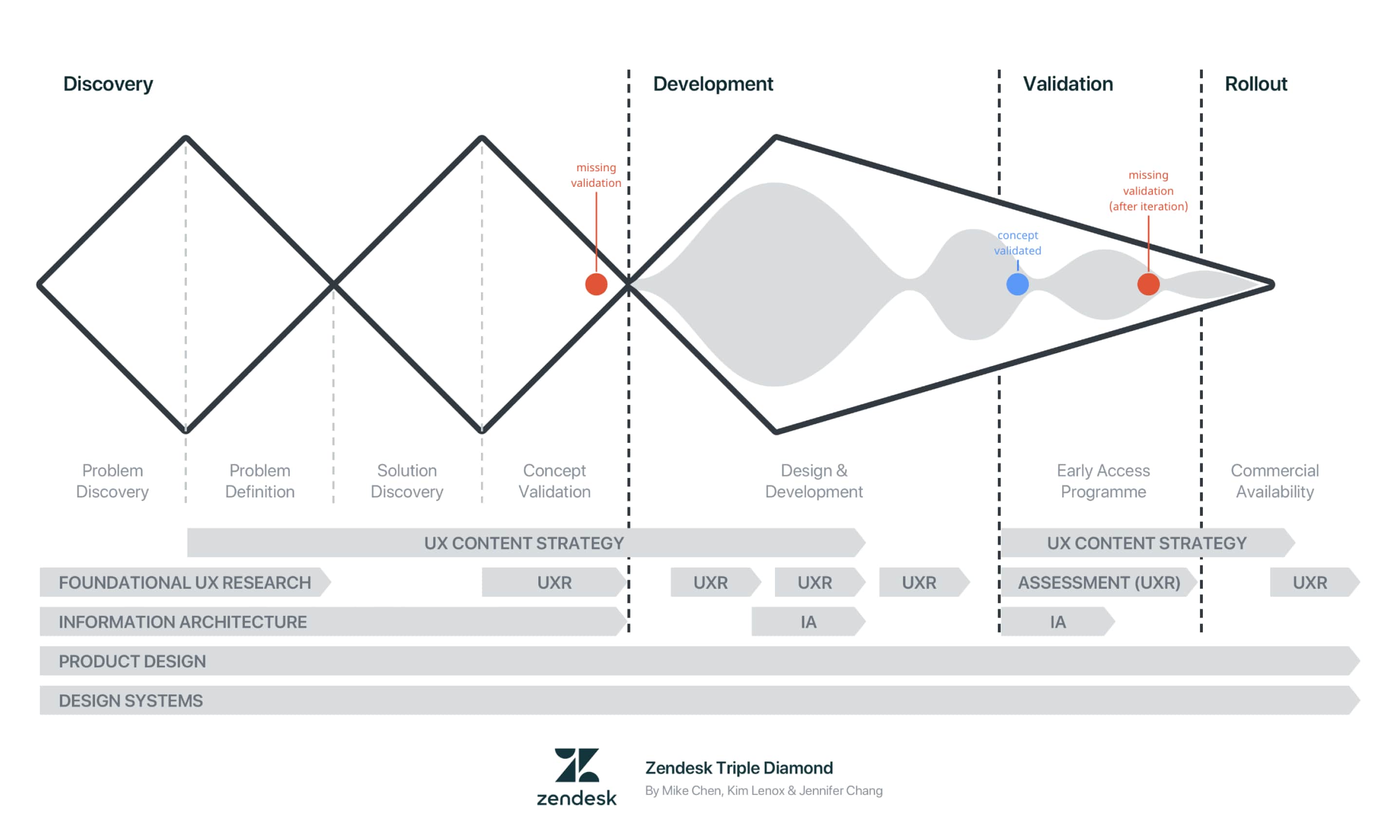
We structured our work based on this amazing concept but, at the end of the project, I realized that we missed a few key steps on the way.
Problem discovery and definition: I’d say our initial research was very efficient: we gathered not just business requirements but also user needs and technical limitations. We formulated our problem statement and stuck to it until the end. Also, we benchmarked the feature and managed to discover opportunities to make our solution highly competitive. So, we acted like a very reasonable and adaptable team.
On a more critial note tho, I think it's relevant to highlight that after two years of completion, this feature wasn't requested by any other clinic, which means that it’s been one of the most expensive projects we have undertaken. I believe that researching the problem before signing off on this deal would have given us more tools to measure its future impact.
Concept validation: Due to time and budget restrictions, we tested our solution only after technical implementation. I noticed that there were a few issues attached to this practice:
- Testing after the technical development (only) can be super expensive and inefficient as some parts of the feature can quickly become useless or obsolete.
- The time we avoided during the first validation summed up to the development phase, resulting in a delay in the rollout.
- The designers and researchers remained blind until (almost) the end of the process, making them incapable of assisting the team and assessing the product properly. This can have several additional negative effects:
- Designers might feel highly responsible for the potential slowdown of the pace, which can bring a lot of frustration and insecurity.
- Sure, the UX team should know well the product and the impacts of not counting on user data. However, this is more often than we'd like to admit a shared responsibility with product managers, and occasionally, developers. So, not being able to test early on, in some cases, might signal profound issues about the integration of UX practices into the team.
- Designers not facing the real challenges of testing may fall into ego traps, possibly making them grow narrow-minded and incapable of dealing with feedback.
- Not testing from the get-go can set the wrong idea that it is OK to move forward without the essentials. This can easily make people question why to invest in research if things can be 'perfectly' done without it.
- Depending on the seniority of the UX squad, they might end up confused about their right to push for more user insights. For a junior member, for instance, it could be very uncomfortable to ask for more time, budget, or other company resources if the group doesn't yet have experience with these methods and tools.
Development: When the solution lands on the third diamond, we should have less uncertainty in the team. By not validating at the right stage, developers may not fully understand where the feature is heading to because the MVP is not yet stable. We experienced that if we modified some basic things once, it wasn't a big deal, but if we kept going like this, the tasks became more confusing and tricky to tackle over time.
Validation: the cool thing about the triple diamond is that teams can be flexible and adapt the project and the flow to their needs. That's what we did. At first, it felt like we discovered the perfect way of adding UX inputs incrementally into the development process. Sadly, the reality showed us that once you are already at the last step, going back to the concept phase can slow down the process and bring more pressure to the UX team.
Rollout: one more reason to feel like pros. No delays, no issues, straight release to the Apple Store, and great news to share company-wide. As we looked at this one project as a silo, we finished it with a smile on our faces. The truth is that we didn't even have metrics to understand if it all had worked. It took us half a year to build analytics to monitor the app's performance. Fortunately, it all went fine, but not until we created a case study did we understand that we were not giving our best. We simply got lucky.
Conclusions
As a designer, one of my main takeaways was never to ignore the validation. Some businesses fear spending too many resources testing and never moving forward. However, there are many (and quick) ways to validate concepts. A simple, remote test is much better than nothing.
Internal processes evolve constantly. We might have missed a few points of the triple diamond methodology, but that doesn't necessarily mean this was a defeat. More the contrary, now we see new opportunities to grow! Nobody said that finding the right balance was easy ;)
Related projects
-
See project →
Hospital Administration
Product design -
See project →
Ada Health Website
Visual design -
See project →
Document scanning feature
Product design