Hospital Administration
As the main Product Designer at ConnectedCare, I led the design of the first web configuration system which enabled hospitals to customize document requests and to produce informative content for their patients. During this project I was responsible for:
- Leading the design strategy
- Establishing reusable patterns and architecture
- Designing dual user flows (for hospitals and content managers)
- Company: BEWATEC ConnectedCare
- Role: Product Designer
- Timeline: April 2021
- Team: Product Manager, Product Designer, 3 Engineers, UX Researcher
Context & Problem
The core challenge of this project was to give hospitals and content managers configuration freedom (setting precedents for all future administrative tools) while ensuring patients encountered clear instructions.
Key Constraints:
- No 3rd party integrations
- Two-language support
- Tight deadline (2 to 3 months)
Success metrics:
- On-schedule feature delivery
- Positive customer feedback during beta testing
- Minimal support requests post-launch (target: near zero critical tickets)
User Research
Working with our UX researcher, I conducted stakeholder and customer interviews, identifying two primary user groups:
Hospital Administrative Staff
Front desk staff configuring patient document requests for the first time.
Needs: Intuitive setup without technical knowledge, quick document selection, confidence in correct configuration, minimal interface complexity
Pain Points: Limited technical expertise, high-stakes responsibility (setup errors delay admissions), time pressure during onboarding
ConnectedCare Content Managers
Internal team managing translations and content accuracy across multiple hospitals.
Needs: Efficient cross-hospital document review, clear translation workflow, content validation before patient visibility, hospital-document usage tracking
Pain Points: Scaling content management across clients, ensuring translation accuracy, coordinating hospital-specific content requirements
Design Approach
Wireframing & Stakeholder Alignment
This feature required connecting our web application to our content management system (CMS), a technical challenge with multiple possible solutions, each affecting the UX differently. I realized right away that product, design, and engineering needed to align before we chose a path forward. I prepared a few wireframes and organized a workshop where we discussed competing priorities, reviewed user needs, evaluated the pros and cons of each approach, and agreed on a solution that worked for everyone.
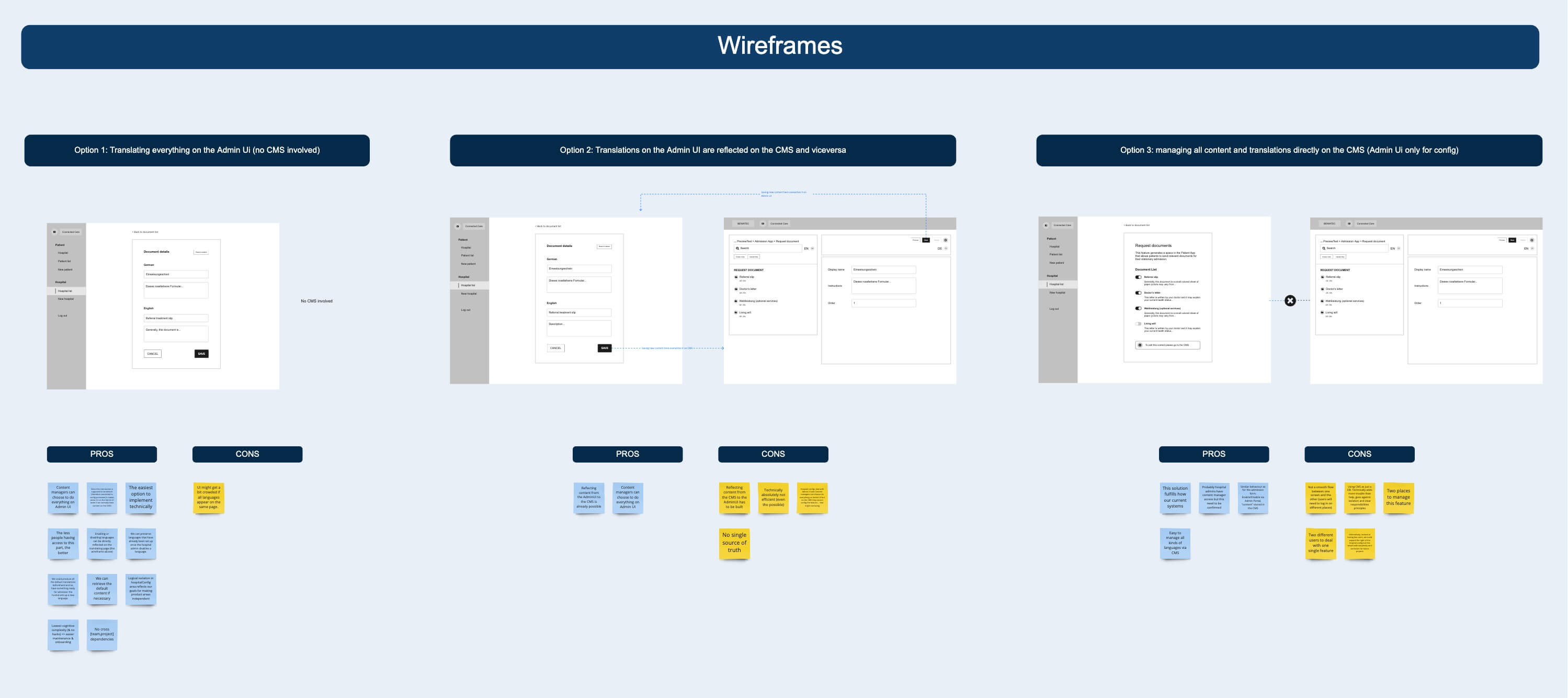
I was particularly proud of this process as it not only solved the immediate challenge but established a cross-functional alignment framework we reused in future projects.
Design Critique
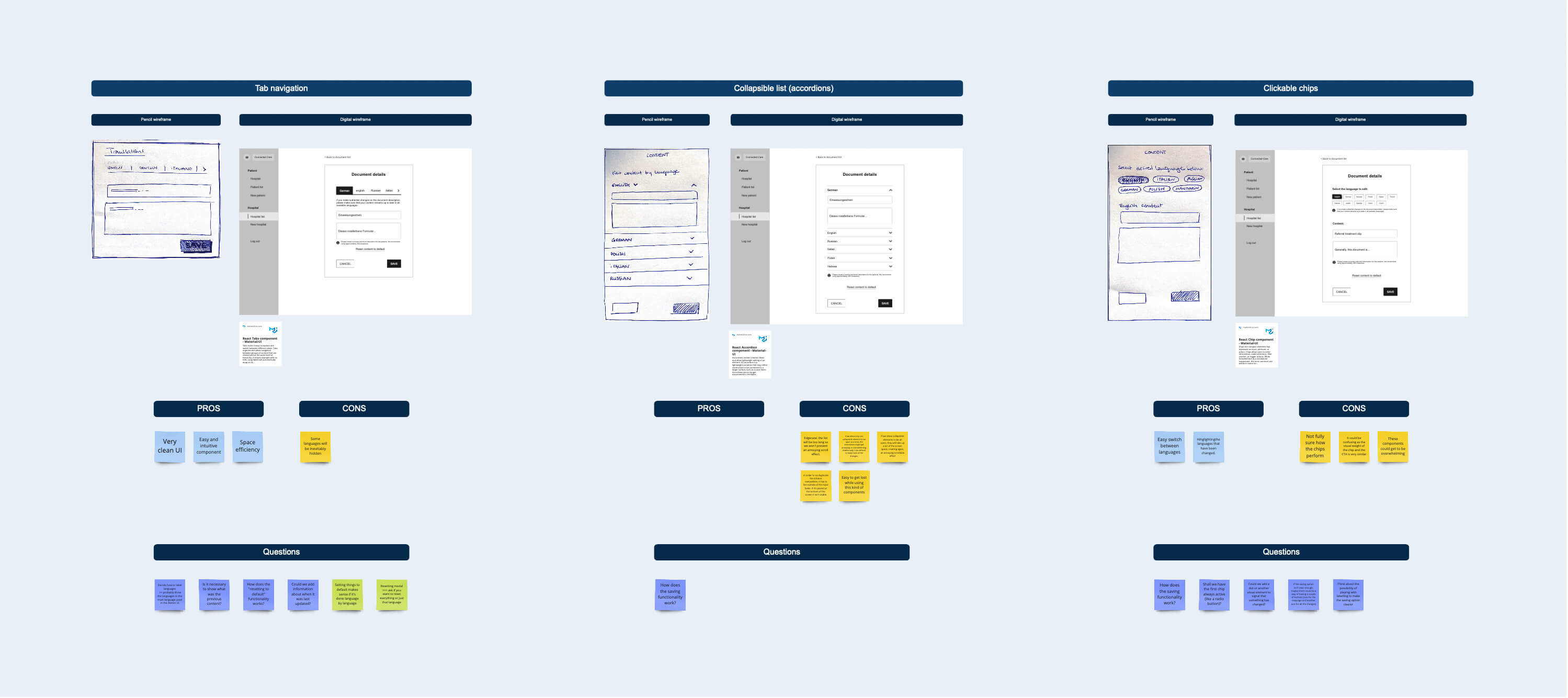
The technical solution enabled content managers to edit text directly in the web application, making the feature easy to find and use. However, managing multiple languages in a compact interface introduced risk of user error or confusion. To ensure I got this right, I brought the design team together for a thorough Design Critique session to establish interaction and navigation patterns that would scale across future features and prevent mistakes.
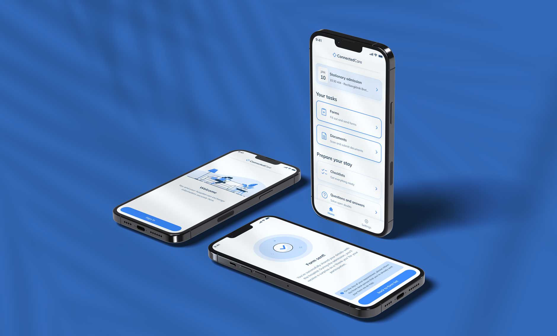
Final solution
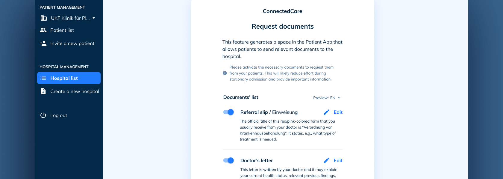
The final design enabled hospitals to customize document requests without technical expertise while giving internal teams efficient tools to manage translations and content.
Configuration flow: it provided a clear entry point with on/off toggles, real-time patient preview, and confirmation steps to prevent errors.
Content management flow: it offered a dedicated translation tab with language selector, inline editing, character validation, and bulk actions for efficiency.
Key design principles: usage of scalable patterns for future features.

Results
- Successfully launched on schedule
- Positive feedback from hospital clients during beta and post-launch
- Zero critical support tickets in first 60 days post-launch
What I Learned
- As this was the first configuration feature, every design decision carried extra weight. I learned the importance of thinking beyond the immediate feature to create patterns that would scale.
- The workshop format I developed proved highly effective at surfacing hidden constraints and building shared ownership. The key takeaway was that early and structured collaboration prevents expensive misalignment later.
- Our success metrics were relatively lightweight and very focused on launch timing and basic satisfaction. While we got positive outcomes, I saw the need for more rigorous UX metrics in future projects.
Related Projects
-
See project →
Patient Application
Product Design -
See project →
Ada Health Website
Visual design -
See project →
Icon Set
Visual design